


Before you read your favorite author’s work relative to the outlook for today’s markets, we invite you to go back into their article archives and see what they were saying in early 2008 and the summer of 2008. On February 13, 2008, with the S&P trading at 1,348, we published Technical Breakdowns Call For More Hedging. Unfortunately, much of our analysis from early 2008 applies to the current market, which is showing indications that a new bear market may be on the horizon.
We are not yet in bear market territory, but we have seen enough to go to a significant cash position complimented by silver (SLV) and gold (GLD). We still have exposure to stocks (SPY) since similar markets have recovered in the past (1994, 1998, and 2004). Even in the context of a bear market, the S&P 500 could rally back to the 1,260 to 1,280 level, which aligns well with the early stages of a new bear market. The Fed’s upcoming Jackson Hole gathering could also be a catalyst for stocks and commodities.
Before we show you the current charts of the S&P 500 Index and the ailing French bank Societe Generale, let’s review our comments concerning U.S. financial stocks in July 2008, several months before the implosion of Bear Sterns and global financial system. The full text can be found in Risk Management in Trending Markets. The S&P 500 was trading at 1,234 when the comments below were made. It hit 666 in March 2009.
The chart below [of the Financial Index (XLY)] illustrates the structural nature of the problems facing the housing and financial industry. There are fundamental reasons financial stocks have been hit so hard, reasons which go way beyond short selling. Additional bank failures in the coming months would not come as a surprise, which is supported by the rapid deterioration of the sector.
If we look at the present day charts of the S&P 500 and Societe Generale below, we are concerned that something is wrong, above and beyond what is known by the markets today. We would not be surprised to see a major negative news event surface in the coming months; it may be a bank that runs into trouble, it may be a country, it may be a currency. What form the event may take is not all that important. What is important is that the charts below are trying to tell us to be very, very careful over the next few months.
French bank Societe Generale has dropped 61% since late February 2011. The 200-day moving average has rolled over, which increases the odds of bearish outcomes over the next few months. A sharp snap-back rally is also quite possible even if Societe Generale has already entered a bear market. Societe Generale’s Relative Strength Index’s (RSI) recent trend looks like a bear market, not a bull market (see bottom of chart below). The failure to break into the orange box is a yellow flag for all risk assets. It is not time to panic, but is it a good time to have specific risk management contingency plans in place. Societe Generale could rally all the way back to its 200-day moving average. However, the negative slope of the 200-day tells us a rally may not produce higher highs.

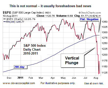
The current chart of the S&P 500 looks a lot like the U.S. Financial Index did in July 2008. You can blame speculators and computerized trading for the recent vertical plunge, but the speculators and trading algorithms properly identified serious structural problems with banks and mortgages in 2008. Have you ever seen speculators successfully attack a sound company? Almost without exception, when markets focus on a company in a negative manner, something is fundamentally wrong with that company. Enron stock began to drop well before the fraud came to light.
For those of you that feel government debt problems cannot derail strong companies like Coke and Apple (‘my stocks will be fine’), this video reviews parallels between the mortgage/housing crisis and the current debt crisis. While iPads are great, no stock may be immune to the selling if our leaders cannot plug the holes in the debt-crisis deck. The ship is still floating so there is some hope for bullish outcomes, but we are taking on water fast.
Recent comments relative to the newly formed debt committee do not give us much confidence that they “get it” in our nation’s capital, even after recent events. Bloomberg reported the less than co-operative tone is unlikely to change between the two major political parties in the United States – markets want to see some unity and leadership, not this stuff:
Grover Norquist, president of Americans for Tax Reform, an anti-tax group, said the Republican negotiating team will serve as an effective roadblock to tax increases. “Taxes are off the table for this super-committee even more than they were when Boehner and Mitch McConnell” were negotiating with the president for a long-term debt agreement, Norquist said. “We’re now going to focus on spending cuts, and if the Democrats can’t do that, we’ll have the automatic cuts.”
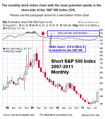
We follow the 223 most liquid ETFs using the CCM Asset Allocation Model. We recently reviewed all 223 in detail. The list of ETFs includes stocks, bonds, commodities, and precious metals. While it has not fully given a “buy” signal, the best stock chart of the bunch is the Short S&P 500 ETF (SH), which is another reason to have bear market contingency plans within an arm’s reach.
If you are reading this analysis when the S&P 500 is experiencing a monster rally, keep the three historical rallies below in the back of your mind:

The three rallies above occurred in the context of a bear market. If the current market can rally and the S&P 500’s 200-day moving average can turn back up, then we would be more willing to push our bear market concerns aside. But a rally that occurs with a downward sloping 200-day moving average, even a big rally, should be viewed with a dose of skepticism.

The charts of the three rallies above illustrate two more points about bear markets:
- Volatility picks up
- Sharp rallies are common
We want to emphasize that it is not all gloom and doom. If leaders step up and lead on debt issues, markets could experience a monster rally, similar to what happened after sharp declines in 1994 and 1998. Our two primary market models remain in bull market territory, but they are hanging by a thread. The CCM Bull Market Sustainability Index (BMSI) closed at 215 on August 10. The historical risk-reward profile remains positive, but we are on the cusp of slipping into bear market territory. The BMSI tells us to be cautious, but in a manner that leaves the door open to better than expected outcomes.

The CCM 80-20 Correction Index also sits in a range still associated with bull markets. However, unfavorable risk-reward ratios will surface if stocks cannot gain traction soon. The 80-20 Correction Index closed at 516 on August 10, 2011.

The ADX indicator at the top of the weekly S&P 500 chart below measures the strength of a trend. The last time the red ADX line hit a level as high as the recent level was in 2008 (compare points A and B). Notice the negative outcome in stocks after point A. The black ADX line also sat at low levels in 2008, just as it does today. Not the end of the world, but it is another feather in the bear’s cap relative to the intermediate-term outlook.

The thin blue line in the chart above is the 200-week moving average, which sits at 1,155. A weekly close over 1,155 would be a good step for the bulls. Notice how the 200-week has acted as both support and resistance (green, red, and orange arrows).
Source: Ciovacco Capital


