


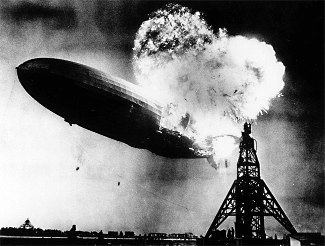
The ominously named Hindenburg Omen has been popping up again in the news, making investors jittery and slightly more nervous about the market exploding in a ball of flames. Before we get into whether or not investors should be ready to hit the sell button, let's first look at what the heck the "Hindenburg Omen" is and why it's important. A short description of the frightening market-event is provided below from Wikipedia. Named after the famous Zeppelin airship that exploded in a disastrous fire...
The Hindenburg Omen is a combination of technical factors that attempt to measure the health of the NYSE, and by extension, the stock market as a whole. The goal of the indicator is to signal increased probability of a stock market crash.
The rationale is that under "normal conditions" a substantial number of stocks may set either new annual highs or new annual lows, but not both at the same time. As a healthy market possesses a degree of uniformity, whether up or down, the simultaneous presence of many new highs and lows may signal trouble.
Theoretically, the Hindenburg Omen could be applied to any stock exchange; however, some minor alterations to the omen might be needed to achieve similar results.
While the market does not enter a crash or bear market after every cluster of Hindenburg Omen signals, every market crash or bear market has been preceded by a Hindenburg Omen. That is similar to the Wall Street axiom that the stock market has predicted 12 of the last 10 recessions. However, because every bear market or crash was preceded by a Hindenburg Omen signal they should not be dismissed lightly.
In essence, market prices must observe the fundamental law of supply and demand. If there is greater demand for a stock than supply (more buyers than sellers) the stock will rise in price and vice versa. If the cumulative flow of investor capital nets out to more buyers than sellers you will see stock prices rise—it’s that simple. In strong and healthy bull markets you have far more buyers than sellers and so you see far more 52-week new highs than 52-week new lows. However, as investor capital is used up and there are fewer buyers around, eventually more and more sellers emerge so that you have an equal number of buyers and sellers, this is typically when the markets begin to slow and a top emerges. The Hindenburg Omen attempts to identify these periods when there is a balance between buyers and sellers that characterizes tops and why so many investors pay attention to it.
Perhaps the best illustration of the process for market tops comes from Paul Desmond of Lowry’s Research who provides his insight during an interview with Barry Ritholtz.
Q&A: Paul Desmond of Lowry’s, Part II
Let’s focus on the tops. We talked a little bit about breadth and we talked about how a top is a process, unlike the bottom being more or less a point. If investors are a little concerned, what should they specifically be looking for in order to see signs of a market top?
Well, if we were in the fall foliage season prior to winter, what we would tend to see in the trees up north, we’d start to see leaves dropping off the tree one at a time. And the stock market is very, very similar, that as you get into the latter stages of a bull market, individual stocks tend to peak out and begin to drop into their own individual bear markets, while there are still a lot of stocks continuing to advance.
As the bull market becomes more and more mature, a greater number of individual stocks tend to fall off the trees, so to speak, and drift to the ground, whereas the investment community is not watching the leaves, they are watching the indexes. They say, ‘gee, the Dow Jones Industrial Average has made a new high today.’
Let’s talk about that. You recently gave a presentation to a room of professionals where you asked them a series of questions. You were surprised by them, and they were surprised by what you told them. Would you talk about that?
Well, I had a group of professional portfolio managers that we were addressing, and I wanted to tell them about this new study that we had just done. And I asked them, ‘What percentage of stocks would you expect would be making new highs at the top day of the bull market?’ In other words, when the Dow Jones was making its absolute high, what percentage of stocks were also making new highs?
I asked, ‘How about 80%?’ and there were a lot of hands. Then I said, ‘How about 70%?’ and there were a slightly smaller number of hands. ‘How about 60%?’ and smaller number yet. And I think I took it down to about 50% or so.
And I said, ‘would you believe 6%?’ There was this complete silence in the room. Of the 14 major market tops, between 1929 and 2000, inclusive, when the Dow Jones Industrial Average reached its absolute peak, the average percentage of stocks also making new highs on that day was 5.98%.
How about within a few points of their highs?
Well we also looked at stocks within 2% or less of their highs. That number was 16.88% on average for these 14 occasions. Now those numbers range significantly, the lowest point was 6.23% up to a high of 22%. But that still meant that 80% of stocks were not making new highs at the same time the Dow Jones Industrial Average was at its high.
And you also point out that a significant number of stocks not only were not make making highs but had already dropped more than 20% from those highs.
Yes, that’s right. On average, the number of stocks making new highs along with the Dow was 5.98%, but the number of stocks that were off 20% or more from their highs was almost 22%. And in the 2000 case — which I thought was particularly interesting — as the Dow Jones Industrial Average made its all-time high on Jan. 14, 2000, 55.33% of stocks were already off 20% or more from their highs. So that meant that the bear market had really started substantially before, at least many months before, the Dow Jones Industrial Average reached its peak.
Note: For further research, please read “The Warning Signs of Major Market Tops” by Paul Desmond (12/01/2012). Free copy available upon request.
As Mr. Desmond points out, at major market peaks you see plenty of stocks hitting new 52-week lows even as the market is hitting new highs, a point that characterizes the Hindenburg Omen and why it can be useful in avoiding market losses. However, I believe that the Hindenburg Omen has lost some of its usefulness given the number of non-operating companies that are now so prevalent on the NYSE. The NYSE now has a considerable number of closed-end bond funds that trade on the exchange, which cloud the data for 52-week highs and lows, as I'll explain below.
During economic expansions, interest rates begin to rise as the economy picks up steam. This occurs as bond investors anticipate higher economic growth rates typically associated with higher rates of inflation. Thus, you can see stocks rally while bonds sell off. With this backdrop you see stocks hitting new 52-week highs while bonds funds hit 52-week lows. Therefore, looking at the number of securities hitting new highs and lows would be deceiving. Conversely, in the midst of a bear market when investors are pouring into safe assets like bonds and driving interest rates lower and bond prices higher, the NYSE new highs list would be dominated by bond funds and the new lows would be dominated by operating companies (stocks). For this reason I believe that looking at only the number of new issues making 52-week highs and lows is deceiving and why the Hindenburg Omen may have lost some of its relevance.
With that said, it would be unwise to dismiss all Hindenburg Omens outright as they have correctly called prior market tops. This can be seen during the last bull market as we got a cluster of them just as the market was peaking during the July 2007 peak and the October peak as seen below. What I want readers to hone in on though is the spikes in new highs and lows in the bottom panel. Notice we got a cluster of Hindenburg Omens in late 2005 and yet we only saw a mild pullback—not a crash or bear market, which was confirmed by new highs still dominating new lows, as seen in the lower panel. However, around the cluster of Hindenburg Omens in 2007 we saw that new 52-week lows began to dominate new highs; this was the sign of a market topping and why the Hindenburg Omen carried more weight in 2007 than in 2005.

We saw a few Hindenburg Omens in May and yet the market powered to new highs this month, but we are getting a cluster of Hindenburg Omens again and investors are getting jittery. For example, yesterday (08/13/13) there were 349 new 52-week highs on US exchanges, while there were 282 new 52-week lows, thus giving a Hindenburg signal. However, delving into the details paints a far from worrying picture and suggests investors should not be running for the hills.
Looking at the new highs data we see that of the 336 issues that hit new highs, 96% of them were common stocks while closed-end funds, REITs, and MLPs comprised the remaining.

Then, if we look at market cap, 55% were more than B in size and 80% were at least 0M.

Looking at new lows paints a very different picture. There were 282 new lows but only 54% of them were common stocks and 40% of them were closed-end funds and of the 112 closed-end funds, 109 were fixed-income focused and 94 were focused on munis. Taking the 39% fixed-income focused closed-end funds and the 5% of REITS and 1% MLP show that 45% of the total new lows were based on interest-rate sensitive securities which likely reflect the rise in interest rates within the context of an accelerating economy.

Moreover, looking at the market cap of the new lows is very different than the makeup of the new highs. While 80% of the new highs were greater than 0M in size, only 13% of the new lows had a market cap greater than 0M with 79% below M.

So, while the new 52-week highs and lows were relatively close in number, their makeup was very different as new highs were dominated by larger cap operating-only companies while new lows were dominated by fixed-income closed-end funds and very small companies. Additionally, I do not believe the May cluster nor the present cluster of Hindenburg Omens will prove to characterize a market top as new 52-week highs continues to dominate new lows (green shaded box), completely unlike what we saw in 2007 (see chart above).

Source: Bloomberg
Rather than look at the NYSE I wanted to see how looking at operating-only company data appeared and so as to not place a greater weight on large cap stocks I used the S&P 1500, which is composed of 600 small cap, 400 mid cap, and 500 large cap stocks with a sample size just under half of the NYSE. Yesterday we saw 118 new 52-week highs on the S&P 1500 (7.9% of total issues) and only 7 new lows (5 were REITS) or 0.5%; and so there would not have been a Hindenburg Omen on the S&P 1500 yesterday. What is more encouraging is that of the 118 new highs, 76% were cyclicals and 7% were commodity-focused, while defensive non-cyclical stocks made up only 17% of the total. So for every stock hitting a new 52-week low on the S&P 1500 you had nearly 17 hitting a new high and 83% of those that were hitting new highs are economically-sensitive stocks.
Sector Breakdown of Stocks hitting 52-Week Highs in S&P 1500 (as of 08/13/13)
A visual inspection of the number of S&P 1500 stocks hitting new 52-week highs versus lows shows an incredibly healthy market that is dominated by the bulls as the number of new lows is barely visible relative to new highs. This is not what one would expect if the market was in the process of topping in which the bulls and bears were in equal size.

Source: Bloomberg
Summary:
While I would never dismiss a Hindenburg Omen outright, it does make more sense, I believe, to run the criteria on operating-only companies like the S&P 1500 rather than on the NYSE, which is riddled with closed-end bond funds. While we are getting Hindenburg Omens on the NYSE like we did during May, the spike in new lows is largely due to fixed-income (interest-rate sensitive) funds, which I believe are selling off due to a strengthening economy. This makes perfect sense when you run the criteria for the Hindenburg Omen on the S&P 1500, which is nowhere remotely near a "sell signal", given its composition of companies linked to economic growth. That said, I do anticipate we could have some weakness heading into the September FOMC meeting (see “Possible Short-Term Top; No Bear Market on the Horizon”) but do not anticipate any major decline as those referencing the Hindenburg Omen suggest.


