


Summary:
- Hindenburg Omens in November and December proved correct
- Given economic and technical backdrop, this serves as a buying opportunity
- That said, peak in momentum suggests caution heading into 2015
Hindenburg Omens Proved Correct
In early December I commented on the Hindenburg Omen that was signaled on the Russell 2000 on Black Friday, November 28th (click for article link). Since that time we have seen 4 more signals on the Russell, two on the S&P 500, and four on the NASDAQ. These signals provided an early warning that all was not right in the markets as elevated new highs and new lows were occurring simultaneously, something that only occurs at market turning points. Since the November 28th signal, the Russell, NASDAQ, and S&P 500 are off by a little over 4%.
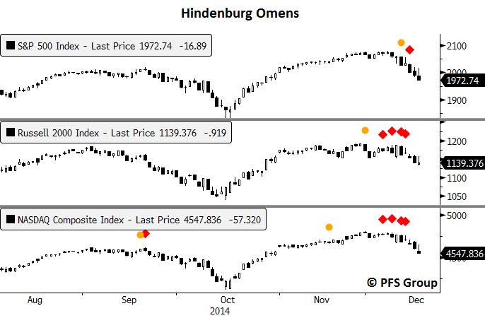
Source: Bloomberg
So, the Hindenburg Omens provided a heads up of a potential pullback and now that we've seen one, now what?
U.S. Economic Backdrop Still Positive
Whenever you are in the midst of a correction it is always a good idea to do a quick survey of the economic and technical backdrop. Are we in a bull market, is the economy in an expansion, or are we in the early innings of a bear market or a recession? If the answers to the above questions suggest we are still in a bull market and an economic expansion, then one has to look at recent market weakness as a buying opportunity when the market stabilizes. On the other hand, if we are moving into a bear market and or recession, one should view any near-term bounce as an opportunity to do otherwise. Thus, one’s macro outlook on the markets and economy should dictate the appropriate action and from my perch I still believe the bull market remains intact (though certainly on weaker footing than in 2013) as does the economic expansion. Let me explain why.
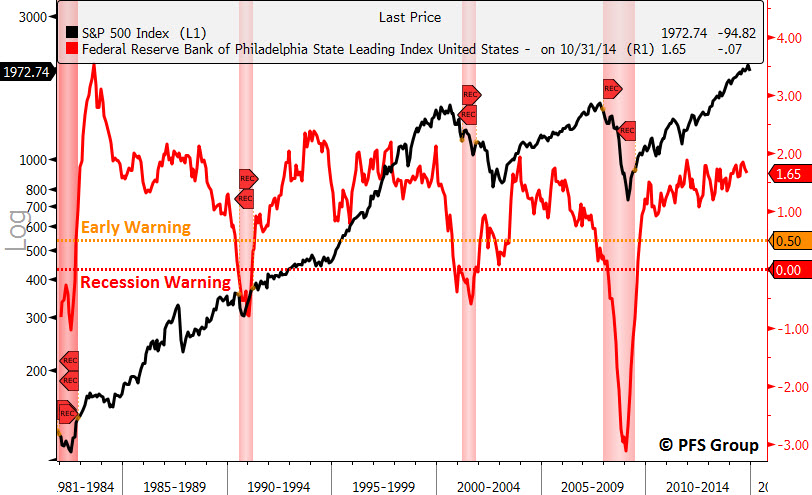
For starters, my recession model suggests only a 1% chance that the U.S. economy is either in or near a recession. I need to see readings north of 20% before I even consider the odds of a recession on the horizon.

Source: Bloomberg
Secondly, the labor market is too strong to suggest any hint of a coming recession. Typically we see the unemployment rate (U3) climb by more than 7.5% year-over-year (YOY) before the onset of a recession and currently the unemployment rate is falling at 8.3% over the prior year. Jobless claims as well typically jump by more than 15% before the onset of a recession and there too we have good news with jobless claims down roughly 10% from last year’s levels.

Source: Bloomberg
One of my favorite techniques for analyzing the markets and economy is breadth, which measures how robust are the economic recovery and bull market by way of measuring participation. Strong economic recoveries should have the bulk of the 50 states recovering and a strong bull market should have the majority of stocks in up-trends. For measuring economic breadth I like to check in on the Philly Fed State Leading and Coincident Indexes. The Philly Fed State Coincident Index report measures coincident economic activity for all 50 states while the Philly Fed State Leading Index measures data that projects where the coincident data will be in six months. The Philly Fed released October data for the State Leading Indexes which showed that 48 out of the 50 states are expected to show increasing economic activity over the next six months and with 96% of the country expected to grow into the middle of 2015, a recession on the horizon appears to be a remote possibility.

Source: Philly Fed
In addition to a forecast of where all 50 states will be in six months, the Philly Fed also projects where the U.S. coincident index will be, which is currently projected to grow by 1.7% over the next six months.
Source: Bloomberg
A Look at Prior Market Tops - Then and Now
Now that I’ve made the case that I think a recession on the horizon remains a remote possibility, let’s take a look at the health of the stock market. Two simple indicators for measuring the level of participation in a bull market advance are the cumulative advance-decline line and the number of 52-week highs and lows in an index. To see how these indicators have worked in the past I’ll take a look at both the 2000 and 2007 tops.
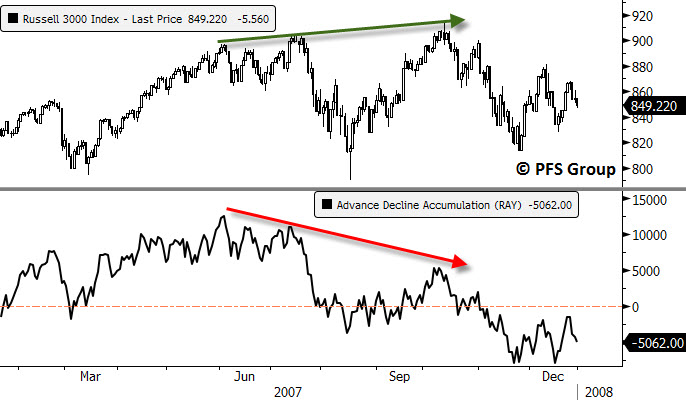
First up is a look at the advance-decline line (click for explanation) and how it performed on the Russell 3000 (represents 98% of the entire U.S. market) at the 2000 top. The idea is that the process for making a market top is similar to the changing seasons between fall and winter. Looking at a tree in fall shows the colors have changed but the leaves remain present on the tree. Eventually as time passes individual leaves fall off the tree one by one until you are in the dead of winter and there are no more leaves on the tree. Similarly, as a market approaches a top, one by one individual stocks in the index roll over and move into their own private bear markets until eventually dragging the whole market down. This process was quite visible at the 2000 top as the advance-decline line (ADL) for the Russell 3000 peaked in the middle of 1998 and never looked back even though the market powered higher led by the technology sector until two years later the market peaked in 2000.

Source: Bloomberg
Another indicator I track is the percentage of new 52-week highs and lows. In a strong bull market you should see only new 52-week highs and in a strong bear market you should see only new 52-week lows. When you see both you often have a market in transition and tracking the spike in new highs during rallies and the spike in new lows on declines can help one gauge when the handoff from the bulls to the bears is taking place. As long as the spike in new highs during rallies is larger than the spikes in new lows on declines, the bulls are in charge. Conversely, when the spike in new lows on a decline exceeds the prior spike in new highs on a rally, the bears take over. Prior to 1998 the spike in new highs greatly outnumbered the spike in new lows on declines; then in 1998 we saw a massive spike in new lows to suggest the bears were in control and they more or less stayed in control until 2003 (as shown partly below). The top in the market was really 1998 when overall market breadth peaked as the final two years of the 1990s were on a weak foundation led primarily by one sector, technology.

Source: Bloomberg
Moving on to the 2007 top, we see a bearish divergence with the Russell 3000 and its ADL as the ADL peaked in June while the market went on to hit a new high in July and October as the market was putting in a top.
Source: Bloomberg
One nail in the coffin to the 2003-2007 bull market was during the June-July decline when the spike in new 52-week lows exceeded the spike in new highs during the June advance. This was the tip-off that the bears were in control and the market was rolling over.

Source: Bloomberg
Are we seeing the same divergences in the ADL and 52-week data now as we did in 2000 and 2007? The short answer is no. The ADL for the Russell 3000 recently hit a new high to confirm the move in the Russell 30000.

Source: Bloomberg
Likewise, the spike in new 52-week highs on the Russell 3000 during the recent rally eclipsed the spike in new 52-week lows during the October route. What was concerning to me that I highlighted in the middle of the year was that the spike in new 52-week highs were weakening AND the October decline did see the spike in new lows exceed the September spike in new highs to show the bears were in control, but the bulls wrestled control back recently and remain in the dominant position again.

Source: Bloomberg
Technical Warning Signs
While the signs of a bull market top like 2000 and 2007 do not appear present with the current bull market that is not to say that everything is rosy either. One of the common characteristics of market tops, whether short-term or long-term tops, is that momentum nearly always peaks before price. One way to measure market momentum is the moving average convergence/divergence oscillator (MACD, click for definition). Looking at the weekly MACD for the S&P 500 at the 2000 and 2007 tops shows that the MACD peaked well before the actual price peak and there was a period of several months in which there was a negative divergence (lower MACD peaks and yet higher market price peaks). This is shown in the yellow shaded regions below.
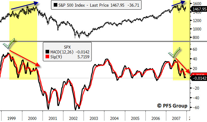
Source: Bloomberg
Looking at the S&P 500 currently shows the weekly MACD peaked in early 2014 and has shown lower subsequent peaks even while the S&P 500 continues to march higher on lower momentum.

Source: Bloomberg
What is of grave concern is that the monthly MACD for the S&P 500 is close to moving towards a sell signal, which would be the first since the 2011 mini bear market and would be the fourth signal since 2000. Given they occur quite infrequently one should listen up to the message of the market when they occur and focus on risk management regardless of the economic backdrop as you can have bear markets without an associated recession (i.e. 1987, 1998, 2011).

Source: Bloomberg
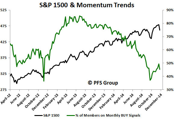
What has me concerned that we could be setting up for our first monthly MACD sell signal since 2011 is that more than half of the market is already on a monthly sell signal. My favorite indicator looks at both breadth and momentum simultaneously, which is the percentage of members in the S&P 1500 with MACD monthly buy signals. The high was seen in the summer of 2013 when nearly 90% of the 1500 members in the S&P 1500 were on monthly MACD buy signals and that number has slowly declined to 44% currently. It is for this reason that I think risk management and a closer monitoring of incoming data will be paramount as we enter 2015.
Source: Bloomberg
Summary
The cluster of Hindenburg Omens on the NASDAQ, S&P 500, and Russell 2000 correctly warned of a pullback in the markets but now that we appear to be stabilizing with the FOMC meeting out of the way how should investors view the recent market weakness? If you are a bull, then you’ve been given a buying opportunity; if you are a bear, then you are likely inclined to raise cash on any ensuing rally.
When I look at the leading economic indicators and recession probabilities I see little risk of the U.S. economy slipping into a recession any time soon. When assessing whether or not the U.S. stock market is peaking, there too I see little evidence that a 2000 and 2007-like top is in.
That said, what concerns me as we head into 2015 is that the market’s momentum has clearly peaked, an event that occurs nearly always before a major top. We are seeing bearish divergences in the S&P 500’s weekly MACD readings and my own measure of breadth and momentum, the percentage of S&P 1500 members with monthly MACD buy signals, is at its worst levels since late 2012 as more than half of the market is on a sell signal.
For this reason we could be in store for a bumpy ride in 2015 as investors adjust to the Fed’s removal of QE and the anticipation of eventual rate hikes.


