


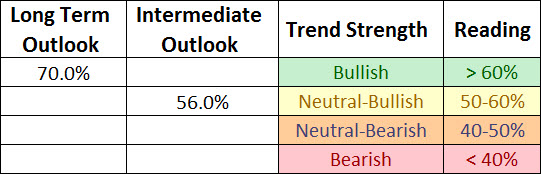
With the equity market rally over the past month our long term and intermediate surveys continued to improve with the long term outlook firmly in the bullish camp (>60%) while the intermediate outlook is close to moving from the neutral-bullish rating to clearly bullish.
* Note: For further explanation of the market surveys and background on analysis, please click here.
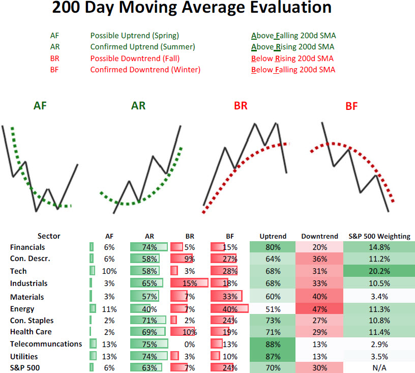
200 Day Moving Average Evaluation
As shown in the table below, the net percentage of stocks that are in long term uptrends increased to 70% while the percentage of stocks in downtrends decreased to 30%.In terms of sectors, the telecom sector takes the top spot as the percentage of its members in uptrends increased to 88% while the utilities sector takes the second spot with its 87% reading. The absolute worst sector remains energy with only 51% of its members in long term bullish trends.
Moving Average Trend Analysis (MATA)
We saw a further improvement in the MATA survey for the S&P 500 in which the percentage of stocks in uptrends increased from to 56%. We saw a decrease in the percentage of stocks in intermediate downtrends decreased to 18%.

52-Week Highs and Lows Data
The data for the S&P 500 for 52-week highs and lows shows that the greatest breadth in terms of new highs continues to come from the defensive non-cyclical sectors with utilities leading the pack (61% new highs in last month) but more importantly is the fact that every sector now has new 52-week highs exceeding the percentage of new 52-week lows as market breadth is expanding to the upside and overall market health continuing to improve.

Source: Bloomberg
Sector Rotation
Below is the relative rotation graph from Bloomberg that shows both the relative momentum and relative performance of sectors versus the S&P 500. Numbers north of 100 show improving relative momentum while numbers below show weakening relative momentum to the S&P 500, and numbers to the right of 100 show outperforming sectors and to the left underperforming sectors.
Over the last few weeks we can see a major shift in relative performance of non-cyclical sectors versus cyclicals sectors (risk off vs risk on) with energy showing the greatest improvement as it has moved from weakening momentum and lagging the market (lower left quadrant) to lagging but improving (upper left quadrant). The greatest deterioration has been seen in the non-cyclical sectors like health care, consumer staples, utilities, and telecommunication (yellow lines) as they have moved from being market leaders with improving strength (upper right quadrant) to market leaders and weakening strength (lower right quadrant). Early and late-stage cyclicals have shown improvement as they are following in energy’s footsteps as they move from lagging and weakening (lower left quadrant) to lagging and improving (upper left quadrant).
Weekly Sector Relative Performance (08/22/2012)

Source: Bloomberg
This is in stark contrast to what we saw leading up to the April 2nd top in the markets where commodity-based sectors (energy, materials) had already rolled over while cyclicals like industrials and financials were also weakening. At the same time defensive non-cyclical sectors like utilities, telecommunications, and consumer staples saw their relative performance improve dramatically.
Weekly Sector Relative Performance (04/02/2012)

Source: Bloomberg
Summary
The market’s long-term and intermediate-term trend continues to improve and the shift away from defensive non-cyclical sectors to offensive cyclical sectors is clearly underway and supports a bullish tone to the market’s health. A further broadening out of new 52-week highs across all sectors also supports a bullish view of the market’s recent strength and suggests a healthy market which is strengthening rather than weakening.


