


One financial axiom often quoted is “don’t fight the tape,” which goes hand in hand with another axiom, “the trend is your friend.” What the two phrases are essentially saying is to not be premature in anticipating market moves. The phrases advise staying long the market in a rising trend, so as to not miss out on further profits, and not to enter a market before a bottom is in ("catching a falling knife"). While the trend may be your friend, often individual sectors, stocks, or asset classes may already be falling while the broad market indices continue to rise. Therefore, looking for the signs often present at market tops may help investors to know when to fold and begin taking profits closer to the end of a trend. This then helps balance the ever present investment dance between risk and reward, of not taking profits too soon while also not becoming complacent, being the last person standing when the music stops.
"What percentage of stocks would you expect would be making new highs at the top day of the bull market?"
One of the key hallmarks of a major market peak is selectivity. In a healthy market trend the bulk of stocks on an exchange or within a broad index are rising, while near a market top fewer and fewer stocks are advancing as individual stocks roll over into their own individual bear markets. Lowry Research Corporation, the oldest continuously published technical investment advisory in the United States, did an excellent study of major market tops and had some interesting findings from their research. Paul Desmond, president of Lowry Research and voted Technical Analyst of the Year for 2009 by The Technical Analyst magazine, was interviewed by TheStreet.com back in 2006 to discuss the Lowry’s report, "An Exploration Of The Nature of Bull Market Tops." An excerpt from that interview is provided below (emphasis added).
Q&A: Paul Desmond of Lowry's, Part II
Let's focus on the tops. We talked a little bit about breadth and we talked about how a top is a process, unlike the bottom being more or less a point. If investors are a little concerned, what should they specifically be looking for in order to see signs of a market top?
Well, if we were in the fall foliage season prior to winter, what we would tend to see in the trees up north, we'd start to see leaves dropping off the tree one at a time. And the stock market is very, very similar, that as you get into the latter stages of a bull market, individual stocks tend to peak out and begin to drop into their own individual bear markets, while there are still a lot of stocks continuing to advance.
As the bull market becomes more and more mature, a greater number of individual stocks tend to fall off the trees, so to speak, and drift to the ground, whereas the investment community is not watching the leaves, they are watching the indexes. They say, 'gee, the Dow Jones Industrial Average has made a new high today.'
Let's talk about that. You recently gave a presentation to a room of professionals where you asked them a series of questions. You were surprised by them, and they were surprised by what you told them. Would you talk about that?
Well, I had a group of professional portfolio managers that we were addressing, and I wanted to tell them about this new study that we had just done. And I asked them, 'What percentage of stocks would you expect would be making new highs at the top day of the bull market?' In other words, when the Dow Jones was making its absolute high, what percentage of stocks were also making new highs?
I asked, 'How about 80%?' and there were a lot of hands. Then I said, 'How about 70%?' and there were a slightly smaller number of hands. 'How about 60%?' and smaller number yet. And I think I took it down to about 50% or so.
And I said, 'would you believe 6%?' There was this complete silence in the room. Of the 14 major market tops, between 1929 and 2000, inclusive, when the Dow Jones Industrial Average reached its absolute peak, the average percentage of stocks also making new highs on that day was 5.98%.
Amazingly, at a market’s actual peak only 6% of stocks on average are forging new highs. What is equally interesting is that Mr. Desmond in the interview later explains that not only were 94% of stocks not making new highs but just over one fifth of stocks had already experienced a bear market decline of 20% or more. When the stock market peaked in 2000, 53.33% of stocks were already down by 20% or more from their highs! What Lowry’s research of bull market tops essentially points out is that a significant percentage of stocks have already experienced a bear market before the market indexes even top, meaning monitoring market breadth for deterioration is a helpful tool in determining whether a major market peak is approaching. Supporting the research conducted by Lowry’s of bull market tops is the work done by Ned Davis Research which had similar findings as pointed out in a MarketWatch article released today (emphasis added).
New highs for the new-high data
Commentary: Bull markets don't end when lots of stocks are hitting new highs
Consider first an analysis of the last 13 bull-market tops recently conducted by Ned Davis Research, the quantitative research firm. On average, the firm found, just 13.2% of NYSE-listed issues were hitting new weekly 52-week highs at those bull market peaks.
At the Oct. 2007 market top, for example, the percentage stood at 14.4%. At the bull market top in early 2000, furthermore, the comparable percentage stood at just 6.4%.
What about the current situation?
Last week, according to the firm, 25.1% of NYSE listed issues hit new 52-week highs. That's higher than the comparable percentages at any of the last 13 bull-market peaks, suggesting to Ned Davis that "the tape is bullish."
This historical comparison is just one data point, of course, but there is more good news imbedded in the new-high data: There typically is a long lag time between when the percentage of stocks hitting new weekly highs reaches its peak and when the bull market finally tops out.
In fact, according to Davis' calculations, the average lag at the last 13 bull-market tops was 33.6 weeks -- nearly eight months. And on none of those occasions did the bull market top out before the percentage of weekly new highs.
This adds up to good news, because the peak so far in the weekly percentage of stocks hitting new 52-week highs came the week before last. That's when the percentage rose to 26.7%. Even if that 26.7% marks the highest level to which this percentage rises during this bull market, these historical parallels would suggest that -- if the future is like the past -- the stock market itself might not peak until the end of this coming summer.
Technical Breadth Remains Bullish
To illustrate graphically the hallmark of deteriorating breadth at market tops as commented by Lowry Research Corporation and Ned Davis Research above, the percent of issues on the NYSE trading at 52-week new highs and lows for the 2000 and 2007 market tops are shown below with comparison to the present situation. First up is a look at the 1999-2000 market top which gave an early shot across the bow in the middle of 1999 as the NYSE issues hitting new 52-week lows was beginning to dominate NYSE issues hitting new 52-week highs. This dynamic of more stocks making new 52-week lows versus new highs at the same time the overall market was heading higher is characteristic of an aging bull market nearing its final innings. The spike in new 52-week lows in 1999 gave investors several months warning to ignore the CNBC cheerleaders who were espousing nonsense such as “Dow 30,000.”
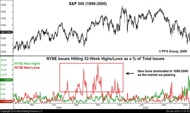
Source: Bloomberg
A look at the 2007-2008 market top also reveals a similar dynamic with the 1999-2000 market top as NYSE 52-week new lows began to dominate new highs in the middle of 2007. While the spike in new lows in the summer of 2007 didn’t give as early a warning of a market top as in 1999-2000, the increase relative to new highs was clearly warning of a market that was breaking down.
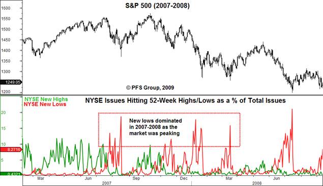
Source: Bloomberg
In stark contrast to the prior bull market tops of 2000 and 2007, the current message coming from the NYSE 52-week highs and lows data is one not of a deteriorating market. Quite the opposite as new 52-week highs are far and away in the driver’s seat. As the market was peaking in 2000 and 2007 the percent of NYSE issues hitting new 52-week lows would often spike north of 10% of total NYSE traded issues. However, in the present case new 52-week lows are absolutely silent as they hit only 0.27% at the October 2008 short term low, barely noticeable relative to new 52-week highs in the figure below. The current NYSE new 52-week highs and lows data below is characteristic of a healthy advance rather than a deteriorating market that is in the topping process.

Source: Bloomberg
That being said, this was the same case in early 2007 as new lows were muted while new highs were still spiking in the 10%+ range. It wasn’t until the summer when the market began to deteriorate significantly as new lows began to spike. Thus, investors would be wise to continue monitoring NYSE new 52-week high and low data ahead.
Economic Breadth Remains Bullish
In a similar concept of deteriorating market breadth (NYSE 52-week high/low data) being used for determining a market peak, deteriorating economic breadth can help shed light on a potential coming recession which should begin to be discounted by the stock market in advance, which typically leads economic activity by six to nine months on average. Three economic breadth measures are highlighted below to determine if the economic health of the United States is deteriorating or not. If they are deteriorating then we can expect a likely deterioration in the stock market, while it would be hard to argue for a major market peak if all three economic breadth measures are improving.
First up is the Philly Fed State Coincident Index (PFSCI) that measures the economic health of the nation by measuring the economic activity of all 50 states of the US. The PFSCI has proven to be a great early warning indicator of a coming recession as it has deteriorated significantly before each of the last three recessions. Perhaps even more important for investors is the fact that it has deteriorated before the S&P 500 peaks prior to the onset of the last three recessions, serving as an earning warning for both stocks and the economy. As seen below, the PFSCI is rising strongly as nearly 70% of the 50 states are showing improving economic activity. Supporting the data from the PFSCI is Moody’s Economy.com state surveys which show significant improvement in most of the country while only one state remains in a recession. Unless the trend deteriorates and does an about face, it would appear premature to argue for either a stock market or economic peak ahead.

Source: Bloomberg

Source: Economy.com
In addition to the economic breadth as measured by the PFSCI is the employment diffusion index of the Bureau of Labor Statistics (BLS) that calculates the percentage of industries hiring. Like the PFSCI, the BLS employment diffusion index deteriorates prior to the onset of a recession and stock market peak. This was the case prior to the 2001 and 2007 recessions as seen below, with the diffusion index deteriorating prior to the peaks in the S&P 500 as well. While the diffusion index is still below neutral (50%), indicating more industries are firing rather than hiring, the current trend is clearly towards improvement and not pointing towards an economy that is deteriorating.

Source: Bloomberg
Lastly, similar to the BLS’s employment diffusion index I developed a retail sales diffusion index that measures the growth in sales of the various categories from the retail sales report. As seen in the figure below, the retail sales diffusion index deteriorates both prior to stock market peaks and economic recessions. Like the PFSCI, the retail sales diffusion index is displaying a strong recovery, showing signs of improvement rather than deterioration.

Source: Bloomberg
Collectively the three economic breadth measures mentioned above support the notion of an improving economy. As the technical data above indicates it would be premature to call for a stock market peak, the economic breadth data also indicates it would be premature to call for an end to the economic recovery, and thus incidentally the stock market. There is no doubt that the current recovery is purely a statistical recovery utterly dependent upon the assistance of the dynamic duo of Uncle Sam and Helicopter Ben. However, emotions and opinions aside, the technical and economic breadth measures are collectively indicating that it may be premature to call for an outright stock market peak. The stock market is currently overbought and ripe for a correction, but given the collective message of technical and economic breadth measures any correction is likely to be a dip in the primary trend, which is presently bullish.


