


Here is the lead paragraph from the Employment Situation Summary released this morning by the Bureau of Labor Statistics, with the bold bracketed text added by me:
Total nonfarm payroll employment increased by 175,000 in May, and the unemployment rate was essentially unchanged at 7.6 percent, the U.S. Bureau of Labor Statistics reported today [an increase from 7.5 percent last month]. Employment rose in professional and business services, food services and drinking places, and retail trade.
Today's nonfarm number was higher than the briefing.com consensus, which was for 159K new nonfarm jobs, and the unemployment rate is higher than the forecast that it would remain unchanged at 7.5 percent. The nonfarm jobs number for the previous month was revised downward to from 165K to 149K.
The slight uptick in the the unemployment rate was slight indeed. Two two decimal places it rose from 7.51% to 7.56%, and that rise can be attributed to a 0.12% increase in the labor force participation rate (driven by a 420K increase labor force participants).
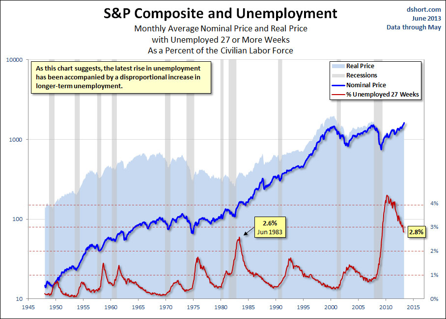
The unemployment peak for the current cycle was 10.0% in October 2009. The chart here shows the pattern of unemployment, recessions and both the nominal and real (inflation-adjusted) price of the S&P Composite since 1948.
Unemployment is usually a lagging indicator that moves inversely with equity prices (top chart). Note the increasing peaks in unemployment in 1971, 1975 and 1982. The inverse pattern becomes clearer when viewed against real (inflation-adjusted) S&P Composite, with its successively lower bear market bottoms. The mirror relationship seems to be repeating itself with the most recent and previous bear markets.

The second chart shows the unemployment rate for the civilian population unemployed 27 weeks and over. The latest number is 3.0% — down from 3.1% last month. This measure gives an alternative perspective on the relative severity of economic conditions. As we readily see, this metric remains higher than the peak in 1983, which came six months after the broader measure topped out at 10.8%.
The next chart is an overlay of the unemployment rate and the employment-population ratio. This is the ratio of the number of employed people to the total civilian population age 16 and over.
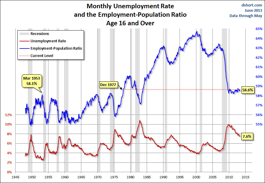
The inverse correlation between the two series is obvious. We can also see the accelerating growth of women in the workforce and two-income households in the early 1980's. Following the end of the last recession, the employment population has three times bounced at 58.2% — a level that hearkens back to the 58.1% ratio of March 1953, when Eisenhower was president of a country of one-income households, the Korean War was still underway, and rumors were circulating that soft drinks would soon be sold in cans.
The latest ratio is 58.6%, which is in the lower half of a consistently narrow range (58.2% to 59.3%) since the end of the last recession.
For a confirming view of the secular change the US is experiencing on the employment front, the next chart illustrates the labor force participation rate. We have now dropped to a level first seen in November 1978.

The employment-population ratio and participation rate will be interesting to watch going forward. The first wave of Boomers will continue be a downward force on this ratio. The oldest of them were eligible for early retirement when the Great Recession began, and the Boomer transition to the retirement will accelerate over the next several years.
What is the average length of unemployment? As the next chart illustrates, we are perhaps seeing a paradigm shift — the result of global outsourcing and efficiency of technology. The post-recession duration of unemployment has remains disturbingly high at 36.9 weeks, an increase from 36.5 last week.

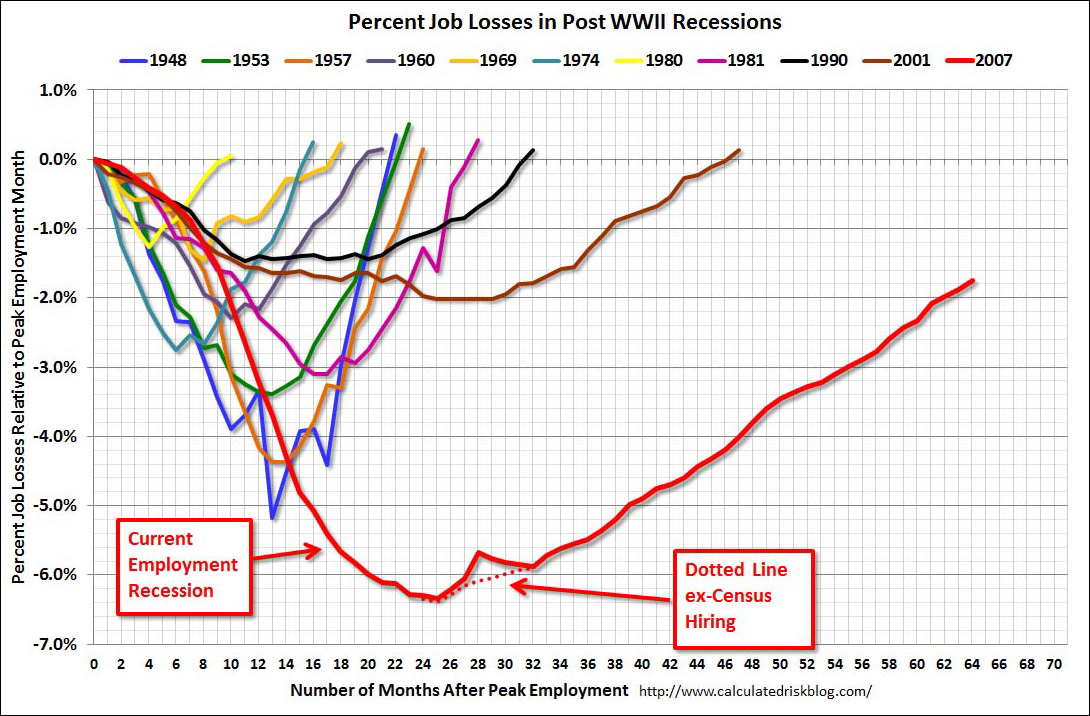
The last chart is one of my favorites from Bill McBride at Calculated Risk. It shows the job losses from the peak employment month since World War II. Note the addition of the dotted-line alternative for the current cycle, which shows unemployment excluding the temporary census hiring.
The start date of 1948 was determined by the earliest monthly unemployment figures collected by the Bureau of Labor Statistics. The best source for the historic data is the Federal Reserve Bank of St. Louis
Here is a link to a Google source for customizable charts on US unemployment data (not seasonally adjusted) since 1990. You can compare unemployment at the national, state, and county level.
Source: Advisor Perspectives


