


 Happy Christmas past, from Financial Sense and the Danielcode
Welcome to 2010 and the new trading year. It promises to be full of excitement and action. Right now, a variety of markets are signalling important developments, and I will cover all of them for you here. But first, my previous article for you at the beginning of December ’09, should have set you all up for a Happy Christmas, as the Gold trade laid out in that article (Knowing the Trend, see FSO archives 12/02/09), came to fruition the very day it was published. This excerpt may remind you:
“Gold-DC 9 day chart
Current period bar completes 12/02
Markets find it hard to close above the regression channel. The upper edge of the channel is at 1175. If this market closes on Wednesday above that number, the most likely prospect is a pullback to the centre of the channel, which for the next period will be at 1128.”

Comex Gold dutifully closed where required on 12/02 and kindly pulled back, not just to the regression mean, but all the way to the lower regression channel. The first bar down went straight to the midpoint as expected, in a trade worth some part of 7 or ,700 per one Comex contract.
That paid for Christmas and a bit more didn’t it? What a trade to end the year.
The chart below shows that move and the sequential drift lower quite nicely, and Gold has now given up 2 from its 12/02 high. And that poses problems for thinking Gold Bulls. But perhaps not yet. To appraise market dwellers of what lies in store, we need to examine all of the evidence that creates the present Decision Point for a variety of markets.

Early Tells
Smart players are always looking for “tells”, those little grimaces, nervous blinks or surreptitious glances that betray the first signs of pressure or stress. The great, and to some surprising, lesson of the 2008 Bear market was that all markets are indeed more highly correlated than was generally thought, and the universal correlation was to liquidity.
One of my favourite tells is the currency carry trades. These take a myriad of forms, but the classic is to pace a strong, low interest currency against an inherently weak, but high interest model. The best of the high flyers is the New Zealand Dollar. With a weak and poorly structured economy, wholly dependant on foreign borrowings and an almost monoline export model dominated by basic agricultural pursuits (cows and trees), we can easily observe the carry trade’s penchant for risk. It rises and falls on emotion, and access, and this is best observed in the NZD-JPY cross, the harbinger, though not the ultimate beneficiary of the Uridashi trade, of which I have written previously.
That trade is being replaced by a variety of cousins with exotic names like “Kangaroo” and “Kauri” as Uridashi being foreign sourced are not eligible for Reserve Bank Repos, aka saving the dreaded bankers, and as such the Reserve in both Australia and New Zealand have encouraged the evolutionary cycle (if there is such a thing) towards domestic clones of the Uridashi, thus giving the all powerful central banks, much more scope to help the commercial banks in their almost continuous times of need.
But that’s a side show. We only need to look at the chart to see how risk appetite in this pair has said volumes about available liquidity. And right now, it’s struggling.
With Japan maintaining its ZIRP as the only visible alternative, in much the same way as US policy makers can’t wean themselves from public support for the beleaguered housing market, this carry is almost a pure liquidity trade. The interest differential has moved from good to better and back, but has largely been in place for the period of the chart below. So we are seeing an unrefined picture of animal spirits. This creature feeds on raw meat. The excess liquidity sort!

If you think this foreign cross is something you can ignore with impunity, take a look at the following chart which pitches the NZD-JPY cross in the top pane and $SPX, the S&P 500 index in the lower pane. What you see is the liquidity meter that marks the feeding of the giant US Equity machine. Liquidity and leverage. Still the mantra of Equity markets.
And with a twist. Our “tell” is a leading indicator for the S&P having topped 3 months before the big index in 2007 and signalled the 2009 lows almost 4 weeks prior to Equity punters believing the Danielcode call for the low at 666.
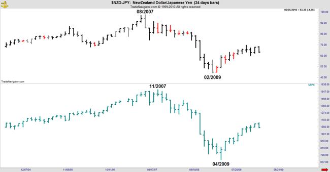
So this is the starting point for today’s discussion. We see this highly correlated and leading indicator telling us that some risk appetite is going out of the market, and lest you again mistake “News” for reality, the initial deleveraging signal from this tell came as early as 12/01/09. We have been watching closely since.
DX-The Market that Binds
DX is a vital link between currencies and Equities, as well as the accepted pricing mechanism for Gold and a host of grains, meats, dairy and other commodities. I have written often in the past of the habitual inverse correlation between Gold and DX and have even highlighted for you the times when that correlation failed, and the likely outcome. At the Danielcode we try to emulate Janus, being neither Romans nor gods, but looking both ahead and behind. To bull markets and bear routs. Both are enjoyed with equal relish, and I make this point merely to enforce the view that I am neither an habitual bull or bear. We see both these conditions in markets and those in the “perma” camp of either persuasion do themselves an injustice. Bull markets happen, and Bear markets happen. Knowing when each will appear is the crucial question, and one that I am laying out for you here.
The change in trend for DX on the 6 day chart, was also laid out for you in “Knowing the Trend”, FSO archives 12/02/09. Below is the relevant excerpt and the supporting chart from that article:
“Last week this market found support at the DC Blue line target at 74.15. A close on Friday above 75.50 (Ed 12/04/09) will be a Buy setup bar on this chart time period.”

That was simple enough wasn’t it? DX duly closed at 75.79 on Friday 12/04 as required by the Long Term Trend Charts (LTTC) published for you by Financial Sense and that was the trend change signal at least on the 6 day time frame. DX is presently at 78.95 which at 00 per point basis the futures contract, has been another nice trade for you.

Long DX and short Gold from the exact day of the high in Comex. What more can we do for you?
There’s More
Being a typical Attorney I like evidence. And for markets, like trials, more is better. Much better. And there’s much more.
So far we have seen a diminution of risk appetite from our favourite “tell”, which translates into greater or less leverage. You don’t need to wade through mountains of econo-stats or belated (and often phony) government stats. It’s on the charts Sport. And nothing is truer than the charts. Because they represent the movement of real, accountable and repayable money. At least that’s the theory. Let me squeeze one more “liquidity and leverage” chart at you before we progress. This is how simple it was to see the air going out of these crucial market props. Just a break of the LTTCs, the most important of which are published at the Danielcode website, www.thedanielcode.com , every Friday. And they are free for Financial Sense readers, so please help yourself.

The break on the 6 day chart came on 12/01. So far this market is holding at the 2nd Standard Deviation Channel, so the jury is still out. On this relatively short time chart (we slide through longer time frames to confirm these moves), this is not the verdict. Yet. But it is part of the mounting evidence that should have your bear side antennae twitching, and on high alert.
S&P
For this most important of Equity markets, the portents have been gathering for a while. First we have the loss of risk appetite discussed above. Then we got the early (6 day chart) trend change in DX. The correlations between DX and SPX are nebulous at best, but of late, much comment has been directed to the DX down; S&P up mantra. In fact it’s an occasional correlation at best, but repeated often enough it is sure to have curried some believers.
The best evidence is always direct evidence. So far we have looked at the indirect evidence, which in market slang I refer to as D2 or derived data. It’s persuasive but still hearsay, and is only useful to support direct evidence. And we are seeing that now from our main player.
Let me preface the next chart by restating that since the Danielcode called the March lows in this market, to the day and a few ticks, we have consistently maintained and published that the trend has been steadily upwards. In other articles for Financial Sense, I showed you the LTTC and highlighted the only sell signals that have been created since March, and both of those were conditional signals that were not elected. Here it is again, but now bought up to date:

You can see the previous Sell setup signals, neither of which were confirmed. If you throw aside the horror stories from those in the perma bear camp, the charts have been adamant that this rally has never been under threat from its inception in March. Now this chart is telling us that it’s time to at least pull your bear cape out of moth balls and give it a shake.
We now have both a regression channel break and a trend change indicator signal sitting on this chart, and both will be confirmed, or refused today, Friday 01/27, by a close below 1114, which seems most probable. Just great timing isn’t it.
But there’s still more. We have an expired 59 DC “week” signal on this chart which matured on 01/12. Depending on when your data set starts, it is possible to see this signal as late as 01/26 on some charts, but there is no real difference as these signals have +/- 1 period variance. And we have the high within our allowable variance from the DC Blue line targets. So on this time frame at least, which is our early warning signal, we have that magic conjunction of “Time and Price” which I write of so often. And likely, dual confirmed trend change signals on the 6 day charts. And that’s very persuasive.
Gold
To standardise our time frames on all these inter linked markets we can return to the beginning of this story by looking at the 6 day LTTC in Gold, below. As we have seen so often before, it is the outlier. Unlike DX, Comex Gold has not shown a confirmed violation of its regression channel, but it does have a confirmed trend change indicator signal current. These two signals, explained in previous FSO articles, are different but supportive; and we are now looking for the channel break signal which is still some time away. The channels move until the bar is completed, which for Gold will happen on next Tuesday 02/02 and that bar needs to close below about 1086 to trigger the Sell setup. That setup signal in turn needs to be confirmed in a subsequent period.

For those who follow the Danielcode LTTCs, you will know that the 6 day chart is the starting point. From signals made on these charts, we look to see the signals translated into the 12 day chart and further.
But there is a body of evidence here. S&P is poised to give its first confirmed sell signal since March. But it may find support at the 2nd standard deviation channel as it did in July ’09.
DX has changed trend to up on the 6 day chart, and we await confirmation of that signal on the 12 day chart.
And that’s the evidence for the bear case Your Honour. The evidence continues to mount that the Equities markets are at “Decision Point.” We may not yet have a verdict but we are seeing warnings. At the least, you should be clear what hedging strategies you will adopt if these Bear signals are confirmed.
I trust you have enjoyed seeing how a clear analytical view of charts, without bias or emotion, can cut through much of the muddled morass that the public media portrays. Recall that most of that bias is business driven. Buy side brokers and long only fund salesmen have a vested interest in promoting the bull case. It’s their livelihood. And the old saying that “It’s hard to convince a man of the merits of your argument, when his financial future depends on not believing you”, is never more applicable than in the mountains of commentary and spin surrounding financial markets.
Put your faith in charts. They are much more truthful than people!
I invite you to visit the Danielcode to see a whole lot of charts. And webinars, and videos. We are passionate about markets and there is much to learn.
Luke 11:29 And when the people were gathered thick together, he began to say, This is an evil generation: they seek a sign; and there shall no sign be given it, but the sign of Jonas the prophet.
Copyright © 2010 John Needham


