


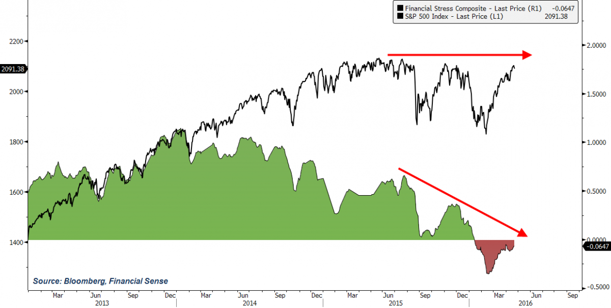
The financial markets are stressed out, though you wouldn't know it with stocks reaching near record all-time highs.
Our chart of the day, shown above, is the S&P 500 next to a composite of widely-followed financial stress indicators available in Bloomberg. The composite is directionally shaded to illustrate when financial conditions have gone from positive to negative and vice-versa.
As you can see, financial conditions were favorable for the stock market, confirming their upward trend, until around 2014. Since then, financial conditions have become increasingly less favorable, diverging from the stock market's higher highs, and finally went negative in 2016.
If this divergence continues and financial conditions deteriorate further, this will certainly raise a red flag that we are at or near a major market peak. As seen below, we saw a similar divergence in 2007 as financial conditions weakened and eventually went negative, just as unsuspecting investors were celebrating new record highs in the S&P 500.

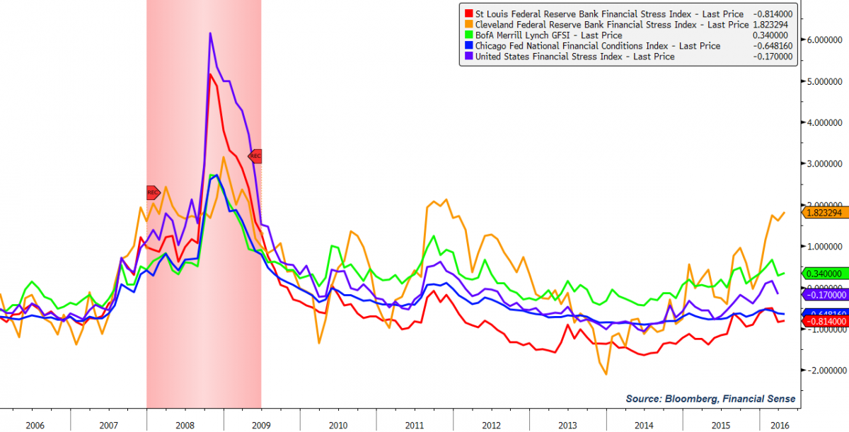
To construct the Financial Stress Composite, we aggregated five major financial stress indices, four of which are created by various Federal Reserve regional banks. Here is a chart of the five components (2008-2009 recession denoted by vertical red bar), with a description provided by the Cleveland Fed on their own particular index:
The CFSI is designed to track distress in the U.S. financial system on a continuous basis. Continuous monitoring gives financial-system supervisors the ability to monitor stressful episodes as they are building. Such early detection is important because financial stress can quickly be amplified when stress is occurring in more than one market.
Since the five indices use a similar calculation methodology, a composite is easily created by averaging the data. We've added a red dotted line to indicate values above or below zero, i.e. more or less financial market stress than average.
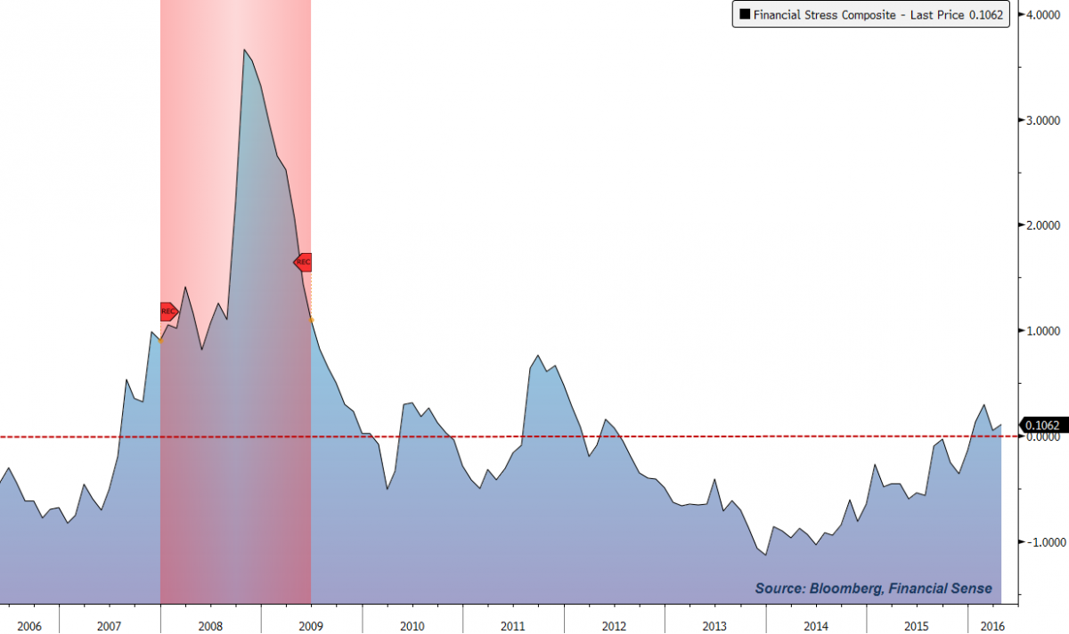
We then invert the data and show above average levels of financial stress in red and below average levels in green.

Next, we overlay it with the S&P 500 to show how financial stress and the stock market move over time. We've highlighted the sections shown by the first two charts where a divergence is seen.

Since negative financial conditions do not always correspond with a major market top (as we saw in 2010, 2011, and, briefly, in 2012), it will be important to monitor whether financial conditions and stock prices are giving the same message going forward.
Bottom line: If this divergence continues and financial conditions deteriorate further, this will certainly raise a red flag that we are at or near a major market peak.
For a complete archive of our podcast interviews on finance, economics, and the market, visit our Newshour page here or iTunes page here. Subscribe to our weekly premium podcast by clicking here.


