


We all know that the “target” of Mr. Bernanke’s second quantitative easing experiment has been equities. But to be honest, there's been an academic method to the madness here. Certainly what Bernanke and friends wanted to create was macro portfolio rebalancing, to be charitable in characterization. Hopefully in brief, by buying Treasuries in an amount that would offset US Federal Government debt issuance since September of last year, the Fed was academically trying to preclude investors from buying the same by essentially bidding up the price and making Treasury purchases unattractive to hold if truly looked at from a risk and reward standpoint ultimately embedded in price. And not just for general investors, but also banks specifically, hoping that by bidding up prices and attempting to buy Treasuries from the banks that the banks themselves would prefer to lend as opposed to using capital to simply buy more Treasuries as an investment of capital option. Although the numbers are not yet publicly available for 1Q of this year, the banks actually sold Treasuries very modestly in 4Q of 2010, so it was partial mission accomplished for the Fed in the period. But as we all know, bank lending has been anemic at best. This Fed intended outcome for the banks has not materialized. Although it’s just our perception, the banks used the money to trade the financial markets (remember that banking system excess reserves can be used as collateral for futures and derivatives contracts – how convenient). So in the absence of bank lending, just what else was QE2 supposed to have done to incite macro economic acceleration? Easy, it was to have sparked the fabled wealth effect among consumers.
QE being this at least quasi-provoked portfolio-rebalancing scheme, by academically making the purchase of Treasuries theoretically unattractive as the Fed bid them to prices above where they otherwise may have traded, the Fed essentially hoped capital would flow to other investment asset classes and inflate their values. And flow it did, but not into real estate as a potential asset class destination (that would have implicitly helped heal household balance sheets and levitated the value of the largest household asset). It flowed into equities, exactly as the Fed had hoped all in the interest of helping to bring the so-called virtuous wealth effect into play. And it also flowed into commodities, not something the Fed has been pleased with as per their “thou doth protest too much” arguments concerning the so-called lack of QE provocation of commodity price acceleration.
So here we find ourselves with the Fed and assorted market “regulators” (and we use that term incredibly loosely) trying to cool down the commodity price acceleration with blatant and targeted manipulation of futures margins. Also, the dollar rally that as been occurring “had” to occur. Certainly what the Fed would like to see is non-commodity oriented equities continuing to ascend, and actual commodities as well as dollar related hedges heading off into the sunset. Anyway, the upshot here is that since “portfolio rebalancing” was a failure in terms of generating an expansion in bank lending, that leaves the wealth effect as the apparent front runner legacy of QE2. So, how’s that wealth effect workin’ out for ya?
I have more than a fair amount of charts to come that I believe very much paint a picture of the character and reality of the wealth effect outcome so far into the current QE2 journey. Although I've covered retail sales many a time largely from a top down point of view, I'd like to drag you through a little chart driven bottom up look at the individual components of the retail space and just how they are contributing, or otherwise, to the so often glossed over top line numbers. They tell an important story of the character of the recovery of the consumer. Is the so-called wealth effect of higher equity prices translating into a greater level of discretionary spending as directly advocated by Bernanke? You'll remember the quote from the Washington Post op-ed piece by Bernanke the day after QE2 was officially announced:
Get it? In the master's own words boosting consumer wealth and spurring spending. Again, so how's that workin' out for ya Ben?
Let's start with a quick look at the current retail sales breakdown by sector. These are April 2011 numbers and weightings. As you'd imagine, the big components of retail sales are sectors I consider largely essentials - grocery, auto's, gasoline and food and beverage (the latter being a mix of essentials and discretionary as that applies to restaurants and bars being a part of the food and beverage categorization).

As promised, here come the charts that really tell their own story quite elegantly. What I've done in all the charts below is simply go back to the early 1990's and look at monthly retail sales numbers for all major categories seen in the official report and express them as a percentage of total retail sales over time. Of course the important issue of the moment is trend. Let's kick this off with what I consider to be the most "discretionary" of the retail sales subcategories - sporting goods/hobbies and building materials.
What I believe is most important is not only longer term trend, but really what has happened since early 2009 – the beginning of the Fed’s QE experiment. As you can see in the top clip below, since early '09, sporting goods/hobbies as a percentage of total retail sales have been falling. In nominal terms sales are up modestly, as I'll review in just one second, but to be falling as a percentage of total retail sales very simply tells us something is displacing them. In the bottom clip, which may be a bit unfair from the perspective of very long-term trend, I’m looking at building materials. First, are building materials really purely discretionary? Of course not. One's home needs to be maintained and if something needs to be fixed, it needs to be fixed. Very little discretion in that. Secondly, without question the rise in trend from 2002 through 2006 was simply coincident with the mortgage credit/housing price bubble. It was certainly an anomaly. But you can see that as of the latest data, we're pushing multi-decade lows in this measure of comparative sales importance. Certainly Mr. Bernanke's attempt at supporting housing prices under QE1 failed miserably. Looks like the QE2 wealth effect inspired lift in retail sales simply bypassed housing one more time.

Without wasting time, on to very much discretionary spending categories that are electronics and furniture/furnishings. Yes, we know full well PC sales are not burning up the charts and at this point, just who does not own at least one big screen/flat screen TV? But offsetting this weakness has supposedly been lines around the block for every new Apple product that has hit the shelves. Appliance softness I can understand as clearly it's replacement and new housing construction driven. But the trend is clear. It's been a near straight shot down since the bottom in equities in 2009. Again, what is displacing the apparent mania over ipads, tablets and iphones, etc.? C'mon, we're looking at a near two-decade low in the current level of electronics and appliance sales as a percentage of total retail sales.
One more time I fully realize that furniture and furnishings are very much related to the housing market. But as you look at longer-term trend, this is true only to a point. Why? As is clear and as is very much unlike the building materials chart clip above, there was no prior period 2002-2006 lift in this measure. More correctly, it has been very much a flat line percentage relationship from 1992-2007! But it's flat line no more, right? It has been nothing but a near continuous southern dance since early 2007.

So as we ponder the so-called wealth effect and the apparent success of QE2 as Bernanke seems to believe (it has lifted stock prices), it sure seems pretty darn clear that the reality of discretionary spending in the retail space has not been a driver of cycle recovery to date in the least. Exactly the opposite, to be honest. Discretionary spending as a percentage of total retail sales has been left behind virtually since day one. And of course the delicious irony is that as you look at all of the charts above, all the trends accelerated downward under QE2! I guess that just like Bernanke's apparent inability to "see" inflation, he also cannot "see" what appears to be the lack of wealth effect generation of QE2 in the actual retail numbers themselves.
Onward. Next up are three categories I believe are a bit less discretionary than already covered. As mentioned above, is food and beverage really non-discretionary? No, not entirely, but specifically discretionary is restaurants and bars that are captured in this categorization. One more time, a near straight shot down really since the outset of 2009. You remember, when the Fed had about trillion less assets on their balance sheet.
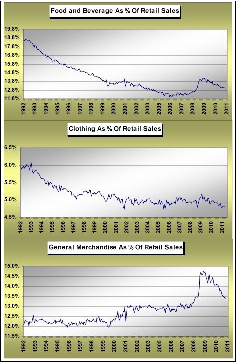
Clothing and general merchandise bring up the rear in the above chart. In good measure, clothing as a percentage of total retail sales has really been flat for a decade and a half. Moreover, as a percentage of retail sales clothing has been declining since QE1 became a market and economic reality. As is also clear, general merchandise as a part of the retail clan has been shrinking since 2008. Lastly, both categories above have declined under QE2. No wealth effect here.
Very quickly, before pushing ahead, you can clearly see in the chart of general merchandise above a big spike up in trend in mid-2008. In the spirit of honesty and integrity, you see that same blip up in mid-2008 in every single chart above. It's simply most pronounced in the general merchandise relationship. What's going on here?
Very simple and it just happens to be fully explained in the volatility represented in the top clip of the chart below. Of course this is one chart showing a huge increase in sector sales as a percentage of total headline reported retail sales over the last few years. As we questioned above, just what the heck has been displacing possible retail strength over the last few years in so many of the charts you saw above? Easy, one of the most non-discretionary of all retail sectors - gasoline. To a point, have gasoline sales as a percentage of total retail sales somewhat followed the directional pattern of the stock market since 2009? It sure looks that way to me. But maybe more specifically, I believe the pattern has followed the rhythm of expansion of the Fed's balance sheet. Isn't it really all one and the same anyway?

Although non-store retail sales as a percentage of total retail sales have been increasing in near linear fashion for years now, this trend has little to nothing to do with the current character of discretionary versus non-discretionary retail sales. You already know what it's all about - the displacement of traditional store based retailers. Howard Davidowitz has been talking about this for years, as it's the exact rationale as to why he suggests the US is two times overbuilt with brick and mortar retailers at present. So I very much consider it a non-event in this analysis of Mr. Bernanke's wealth effect success, or otherwise, and much more an evolutionary pattern of the retail industry mixing with technology.
The picture by now should indeed be crystal clear. The ONLY category of retail that has been growing its sales as a percentage of total retail sales over both of the QE periods has been gasoline, again leaving the non-store retailing trends aside. And this is Mr. Bernanke's wealth effect? To be honest it has indeed worked wonders for wealth generation - the wealth of crude oil producers, that is. The collective and very simple message is that there has been no wealth effect at all if one defines that as an increase in discretionary consumption. The Fed has incited commodity and equity speculation in its QE heroics, with the results being the rising cost of gasoline has acted to "displace" alternative forms of discretionary retail spending. Too bad the mainstream media simply seems not to have had the time over the last few years to dig beneath the pretty retail sales headlines, no? For this is exactly what they would have found.
A few last charts and I'll end this. One chart I did not include above is that of auto sales. Coming right up.
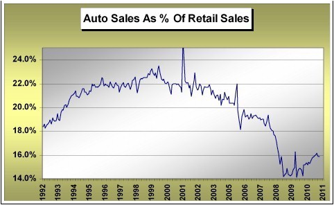
Again, although it's simply my interpretation, I do not necessarily count auto sales as being discretionary spending. Of course choice of auto is indeed discretionary, but not the need for auto purchases themselves. We saw the cash for clunkers blip up in this relationship in 2009, which was short and sweet. During 2010 we made up some ground relative to total retail sales, but maybe that's only to be expected given the implosion in both actual auto sales and as a percentage of total retail over the 2007 - 2008 period and the fact that existing auto's simply wear out. By the way, remember that GM bought subprime auto lender Americredit in the summer of 2010 and the credit machine for GM was cranked up one more time. After all, GMAC worked out so well, didn't it? For GM? Yes. For US taxpayers (who essentially bailed out GMAC)? Not so much.
In the next little view of life, I’m looking at nominal reported retail sales numbers dated since the lows in total retail sales during March of 2009. I take each category and look at the dollar value of growth since that time through April of this year. I’m doing this simply to reinforce the message of the relative retail sales analysis above and look at the "message" for yet another angle of corroboration as to what we are really seeing here that are nominal sales. And wouldn't you know it, the increase in gasoline "retail sales" just happens to clock in at numero uno over the entire period as measured in nominal dollars. Auto's take the number two honors followed by the secular change represented by non-store retailers. But kinda funny, not one discretionary retail category is even near being in the running here. The message is totally clear as I see it. If we define the wealth effect as engendering discretionary retail spending, as is intimated in Mr. Bernanke's WaPo op-ed piece, QE2 was an unmitigated failure. Now if we redefine the wealth effect to mean a higher cost of non-discretionary spending that acts to displace discretionary consumption broadly, then Bernanke and friends hit one out of the park with the back-to-back QE's. Maybe this is the spending Bernanke was referring to?

Last and final chart as I simply cannot help myself. I mentioned above that the measure of gasoline sales as a percentage of retail sales very much resembled the rhythm of expansion in the Fed's balance sheet since 2009. Have a look for yourself below.

Hopefully I’m not stretching to make a point, but it sure looks darn similar. The facts of actual nominal dollar retail sales trends since the Fed’s quantitative easing experience began in March of 2009 seem absolutely clear in their message. There has been no discretionary spending wealth effect engender by the Fed printing money and levitating stock prices. Quite the opposite. The price of commodities has climbed and acted to offset all forms of discretionary spending as per the actual retail numbers. In an environment characterized by lack of inflation adjusted wage growth, should we really have expected a different outcome? Apparently the Fed did. Hey Ben, how’s that wealth effect workin’ out for ya?


