


Every Friday I comment on the technical picture of the market by looking at breadth, momentum, rotation, sentiment measures and other indicators to get a comprehensive picture of the market's internal "health". The main goal of these weekly updates is to provide a clear and unbiased view of the market, identify signs of financial stress associated with major tops, and help investors stay on the right side of the major market trend (i.e, not get shaken out by short-term volatility, media hysterics, or each and every proclamation of a sudden crash.)
Ever since the stock market began, the switch between major uptrends (bull markets) to major downtrends (bear markets) has followed a certain process. Furthermore, this process can be observed long before the market's all time high or absolute peak and, instead, takes place under the surface by looking at stocks collectively, not just those that comprise the major averages. This "subsurface deterioration," as we'll call it, is one reason why focusing on the price of the major averages can be misleading and sometimes unhelpful.
For example, the insightful Lowry Research Corporation conducted an exhaustive study of every market top since the Great Depression and found that the number of individual stocks participating in a bull market clearly declined as the index hit a major peak. Put another way, participation in a bull market fades as individual stocks enter their own private bear markets well before the market peaks. Here is a quick snapshot of their findings when observing the 14 major tops between 1929 and 2007, which is quite astounding.
When the Dow Jones Industrial Average reached its absolute peak:
- The average percentage of stocks also making new highs on that day was 6.38%
- The average percentage of stocks within 2% of their 52-week highs was 16.54%
- The average percentage of stocks 20% or more below their 52-week highs was 22.26%
- The average percentage of stocks 30% or more below their 52-week highs was 10.97%
What I want to focus attention on is that at the actual price peak in the major indexes only 16.5% of stocks are within 2% of their 52-week highs while 22.3% are already in bear markets. This highlights the fact that market tops have an identity crisis when they peak as there are roughly an equal percentage of stocks near new highs as those already in bear markets.
I conduct the same analysis on the S&P 1500 (includes the S&P 600, S&P 400, and S&P 500), which covers approximately 90% of U.S. market capitalization. Below I show the average percentage of stocks within 2% of their 52-week highs and those that are already in a bear market (> 20% decline) as well as the figures seen at the 2007 top and the S&P 1500’s weekly close peak seen on 01/17/2014.
As you can see, the market’s character at the recent January peak looks nothing like 2007 or the historical average since the Great Depression as there are nearly twice as many stocks near their highs as those already in bear markets. This shows the underlying strength of the market is still quite strong and not characteristic of a major market top.

In my recent article (“Market Bottoms Have Two Elements: We’re Still Missing One”) I took a look at the credit markets to see if they were showing the same level of stress in the stock market and the conclusion was the credit markets were barely blinking. Another credit indicator is USD swap spreads, which have shown a tendency to lead the S&P 500 by days to weeks. This is shown below with the USD swap spreads shown in green and inverted for directional similarity. Note that swap spreads bottomed (peaked in chart) in the middle of December a month before the market peaked. It is an encouraging sign that they peaked (bottomed in chart) on 01/30/2014 before the market staged a rally yesterday and have been improving all week.

Source: Bloomberg
The market’s bottom this week has the potential to be a significant bottom as we’ve seen signs of major capitulation by investors as evidenced by ETF fund flows in the world’s largest ETF, the SPDR S&P 500 ETF (SPY). Shown below is the SPY and its 20-day average of fund flows. As you can see, investors have taken the most money out of the market than they have in a decade, with .2B in daily outflows from the SPY over the last 20 days. Prior to this the worst outflow we saw was .1B on 02/25/2008 and suggests we saw investor selling capitulation this week.

Source: Bloomberg
Zooming in on just the current bull market shows that prior large declines typically marked significant bottoms over the last five years and likely signals that we’ve seen selling capitulation.

Source: Bloomberg
In my prior article I mentioned we need to see a surge in buying to suggest the pullback is over, which is fairly obvious, but how does one go about measuring sufficient buying demand? I like to see a strong surge in daily MACD buy signals within the S&P 500 well above the average percentage at 8% and use 10% as my threshold. Currently, we have yet to see a surge in MACD buy signals and if we see only a small improvement in the number of MACD buy signals we are likely dealing with a dead cat bounce and may have more work to do before finally putting in the bottom.

Source: Bloomberg
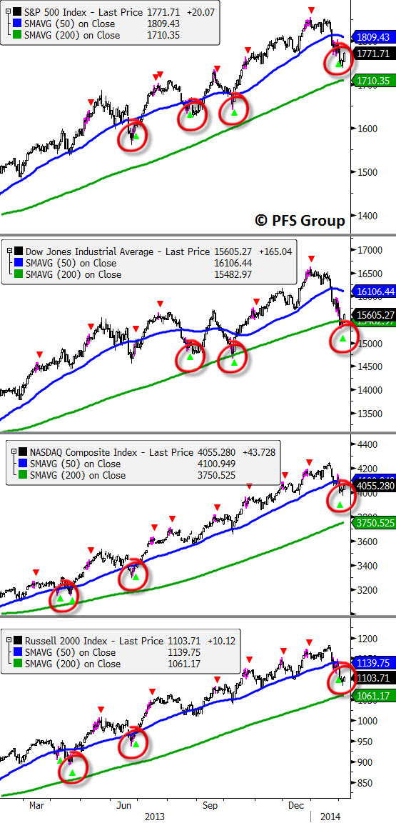
While we have yet to see a surge in buying as evidenced by a jump in MACD buy signals, we do have daily Trend Stall buy signals for four of the major market averages with the past three occurrences correctly identifying the intermediate lows in the S&P 500.
Source: Bloomberg
Summary
The takeaway from this article is to first understand that heading into the January peak we did not see any of the signs that typically mark a major top, in which there is an equal share of stocks near new highs as those in bear markets. In fact, we have just the opposite as there were nearly twice as many stocks near their highs as those in their own private bear markets.
Looking at fund flows out of the SPY shows a record outflow this week and indicates we likely have seen selling capitulation. That said, we need to get past tomorrow's big jobs report, which could swing the markets strongly in either direction. If the markets react favorably to the jobs report I will be looking for a strong surge in buying as evidenced by daily MACD buy signals exceeding 10% on the S&P 500 over the prior 10 days. If that occurs we can reasonably conclude the pullback is over; but if we only see a small surge then we are dealing with a dead cat bounce. Given we’ve seen Bloomberg daily Trend Stall buy signals on all four major averages, the chances are pretty good (outside a horrible jobs report tomorrow) that the lows are in. Stay tuned!


