


The markets had a tough week as the S&P 500 slid nearly 2% with the DOW falling 2.35%. In terms of sectors we saw a defensive rotation into the utility sector, which was up 2.26% for the week, while cyclical sectors such as industrials (-3.16%) and technology (-2.35%) took the greatest hit.
What is beginning to concern me is that the market is making new all-time highs this month at the same time participation in this rally is falling, with the market’s breadth and momentum seeing increasing weakness. While short-term indicators are becoming oversold and suggests we should see a short-term bottom in the next few days, given the widespread deterioration I am seeing we may be setting up for a larger correction, with the mid-term election cycle predicting an intermediate peak in the market between now and the end of April (charts and discussion below).
Market’s Bill of Health
S&P 1500 Member Trend Strength
For gauging the market’s trend we look at the S&P 1500, which encompasses the S&P 500 Large Cap stocks, the S&P 400 Mid Cap stocks, and the S&P 600 Small Cap stocks, and comprises more than 90% of the entire US market cap.
As shown below, the long-term outlook for the S&P 1500 is clearly bullish as 73.4% of the 1500 stocks in the index have bullish long-term trends. The market's intermediate-term outlook slipped another notch as it moved into neutral-bullish territory by moving to 55.2% this week. The market’s short-term trend remains in bullish territory at 80.8%.

* Note: Numbers reflect the percentage of members with rising moving averages: 200-day moving average (or 200d MA) is used for long-term outlook, 50d MA is used for intermediate outlook, and 20d MA is used for short-term outlook.
The most important section of the table below is the 200d SMA column, which sheds light on the market’s long-term health. As seen in the far right columns, you have 73.0% of stocks in the S&P 1500 with rising 200d SMAs and 74.0% of stocks above their 200d SMA. Also, nine out of ten sectors are in long-term bullish territory with more than 60% of their members having rising 200d SMAs, with the telecom sector the only one with a reading below 60%, at 47%.

Source: Bloomberg
S&P 500 Market Momentum
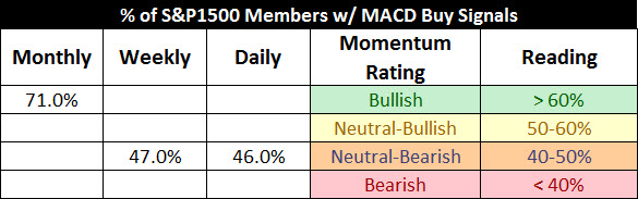
The Moving Average Convergence/Divergence (MACD) technical indicator is used to gauge the S&P 1500’s momentum on a daily, weekly, and monthly basis. The daily MACD flipped back to a sell this week for the S&P 1500. The weekly signal failed to make a buy signal which is concerning as momentum may not be enough to drive the market higher.

Source: Bloomberg
Digging into the details for the 1500 stocks within the S&P 1500 we can see that the daily momentum for the market has weakened markedly from a reading of 83% two weeks ago to 46% this week.
The intermediate momentum of the market improved by inching up to 47% from last week’s 42% reading, as it moved toward a more neutral reading.
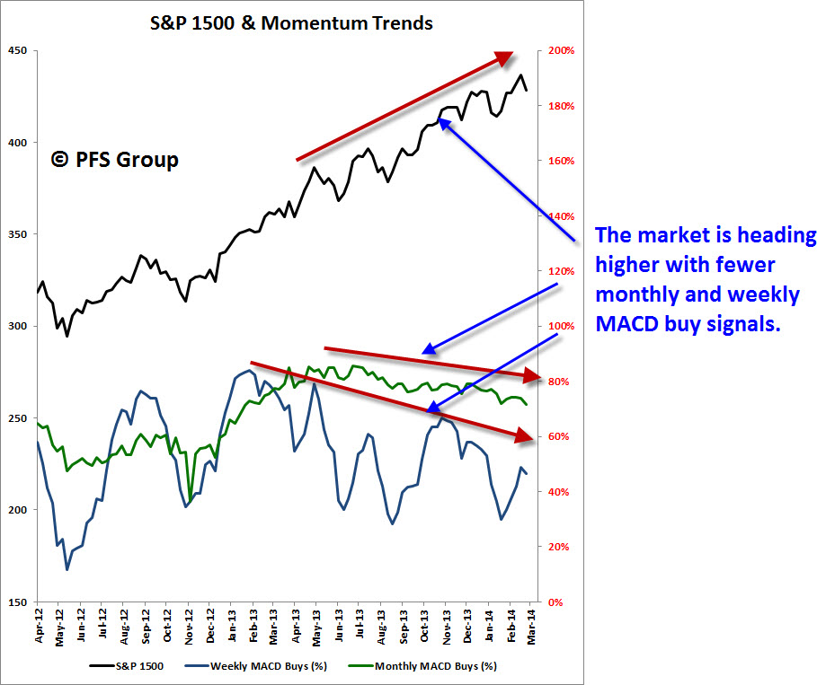
The market’s long-term momentum remains solid at a strong 71% this week, putting it well into bullish territory. That said, as shown in the image below the market’s monthly and weekly MACD signals have been weakening as the market begins to lose some steam.
Source: Bloomberg
Source: Bloomberg
52-Week Highs and Lows Data
What continues to be encouraging about the market is that new 52-week highs continue to dominate new 52-week lows. Looking at the various market cap segments shows the greatest strength in the S&P 500 large cap index with small caps (S&P 600) showing the weakest performance.

Source: Bloomberg
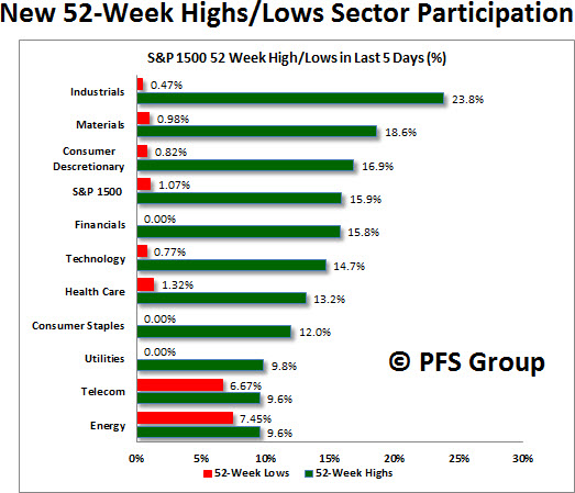
What is encouraging about the figure below is that the defensive sectors, like telecommunications, utilities, and consumer staples, have the fewest new 52-week highs while cyclical sectors like industrials (23.8%) or materials (18.6%) have the largest number of new highs. You would expect the opposite at a major bull market peak.
Source: Bloomberg
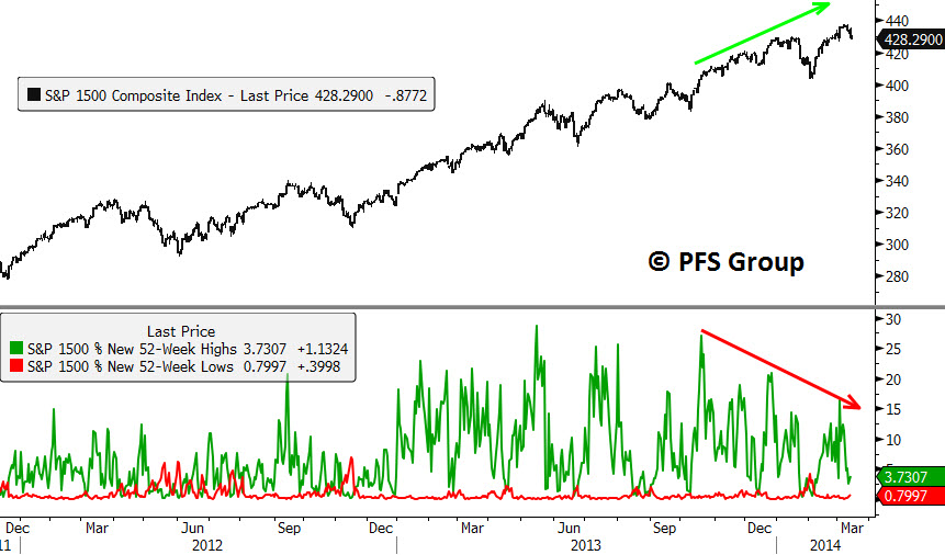
There is concern, however, that the market has made new prices highs and yet there are fewer and fewer stocks pushing the market higher as selectivity becomes an issue. You can see this in the image below with the S&P 1500 hitting new highs while the percentage of stocks within the S&P 1500 hitting new 1-year highs has been diminishing.
Source: Bloomberg
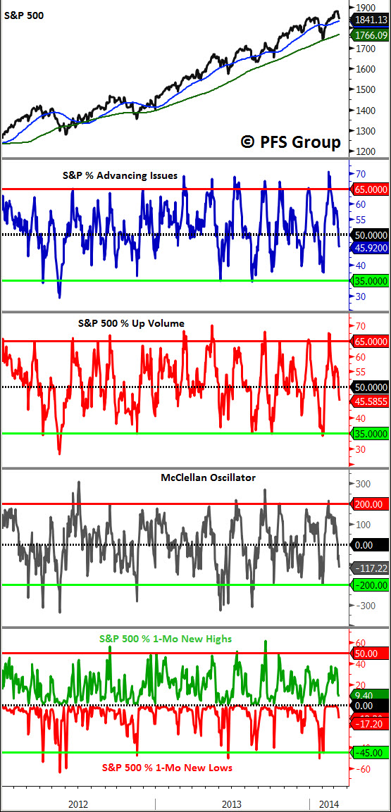
Market Indicator Summary
Below is a multi-indicator chart of breadth and momentum in the S&P 500, which shows we reached an overbought condition in early February but with time and the recent price decline we are about two-thirds of the way to seeing intermediate-term bottoming conditions. My expectation is that by early next week we will likely stage a rally, but, given that breadth has been weakening, I would expect any potential rally to be smaller in magnitude than previous ones as a potential intermediate top plays out.
Source: Bloomberg
The market has a tendency to correct during mid-term election years, with the bottom referred to as the four-year cycle low. Typically, the weakest periods during a mid-term election year are the second and third quarters. Shown below is the market's current percent change (black line) along with three different averages. One average looks at the last mid-term election years during secular bull markets (2010, 1998, 1994, 1990, 1986, 1982), and is shown in green, while another shows the average election cycle during secular bear market years (2006, 2002, 1978,1974), and is shown in red. The average of all years is shown in blue. The overall average (blue line) and the secular bull market average (green), suggest a market peak between now and the end of April before bottoming in the summer and setting the stage for a fall rally.

Source: Bloomberg
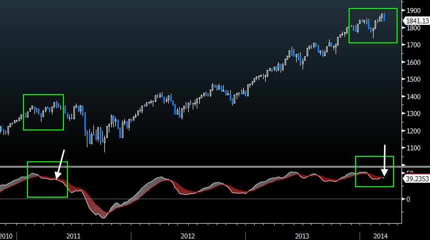
In addition to the concern the mid-term election cycle could lead to a market correction this summer, I am also concerned by the fact the market couldn’t generate a weekly MACD buy signal during the recent rally even though the markets hit a new high. The last time we saw this was in 2011 when the markets sold off from February to March, made a new high in May 2011, but did not register a weekly MACD buy signal. The market was in the process of putting in a top and had a nasty double-digit correction before bottoming in October. You can see the similarities in the chart below showing the rallies to new highs without a weekly MACD buy signal and also, more acutely, in the second chart where I've overlapped these two periods.
Source: Bloomberg

Source: Bloomberg
Summary
I am seeing divergences in the market's monthly and weekly MACD numbers, which have been declining for months. I am also seeing divergences in the percent of stocks making new 52-week highs, which is failing to confirm the market’s new high. We also have a similar setup to the 2011 double-digit correction in which we saw a new market high without a weekly MACD buy signal. Lastly, we also need to consider the historical pattern of double-digit declines during the spring to summer period of mid-term election years.
Overall, the data above does not signify the onset of a major bull market peak, but does indicate the heightened probability of an intermediate top this year before heading higher, quite likely in the fall.


