


The financial distortions that central banks have orchestrated grow more grotesque by the day. Financial risk in the world has rarely, if ever, been higher. We are far past the last bubble peak in 2007 in terms of over-leverage, extreme asset valuations, and complacency. And even those who have managed to block out the correction cycle of 2000-03, should still be able to recall what happened 2007-09 (if they try).
Check out 2029 Financial Collapse: Lionel Shriver’s Dystopian Outlook on the US
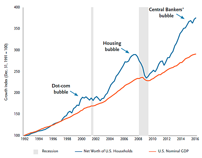
This chart courtesy of Bloomberg and TCW.com captures the big picture view of the last three most epic financial bubbles that have driven household asset values (in blue) far above nominal GDP (red) only to re-couple once more and trigger a recession (grey bars).
Here is an update on the S&P 500 showing the Fed-forged reflex rally since February. Note that virtually all meaningful economic indicators have worsened since then, as prices have rebounded on yet another round of nonsense.

Irrational exuberance has now infected everything from bonds to stocks, real estate, commodities, art and every possible collectible. This means the mean reversion back to realign with economic demand and income levels is set up to be even more extreme this cycle, than the last two bear markets.
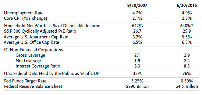
This table captures a good comparison of 2007 and today on some critical metrics.
While assets are priced for large losses far and wide, a world of learned minds are wasting their energy parsing vapid Fed-speak rather than focusing on things that matter. Malinvestment of resources has been the dominant theme of this time. The good news is that we are now in the death throes of Fed faith and economic reality is dawning once more.
For those who are levered or banking on present price levels to hold, conditions are not promising. But for those who can maintain liquidity and wait it out, there is generational opportunity baked into all of this. Time is the test of character.


