


This morning's employment report for July showed a 255K increase in total nonfarm payrolls along with an 18K upward revision for June and a 13K upward revision for May. The Investing.com consensus was for 180K. The unemployment rate remained unchanged at 4.9%.
Here are the lead paragraphs from the Employment Situation Summary released this morning by the Bureau of Labor Statistics:
Total nonfarm payroll employment rose by 255,000 in July, and the unemployment rate was unchanged at 4.9 percent, the US Bureau of Labor Statistics reported today. Job gains occurred in professional and business services, health care, and financial activities. Employment in mining continued to trend down.
Here is a snapshot of the monthly percent change in Nonfarm Employment since 2000. We've added a 12-month moving average to highlight the long-term trend.
Listen to Worth Wray: Central Banks May "Pull Back the Curtain"

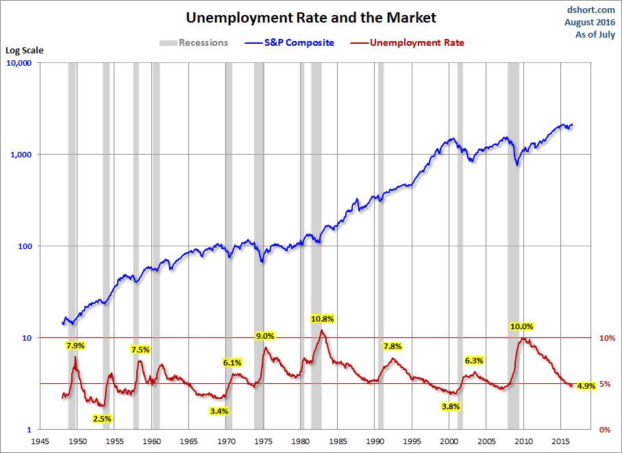
The unemployment peak for the current cycle was 10.0% in October 2009. The chart here shows the pattern of unemployment, recessions, and the S&P Composite since 1948.
Unemployment is usually a lagging indicator that moves inversely with equity prices (top series in the chart). Note the increasing peaks in unemployment in 1971, 1975 and 1982. The mirror relationship appears to be repeating itself with the most recent and previous bear markets.
We've added another chart to illustrate the reality of the unemployment rate - the unemployment rate divided by the labor force participation rate.

The next chart shows the unemployment rate for the civilian population unemployed 27 weeks and over. This rate has fallen significantly since its 4.4% all-time peak in April 2010. It is now at 1.3%, up from 1.2% the previous month.

The next chart is an overlay of the unemployment rate and the employment-population ratio. This is the ratio of the number of employed people to the total civilian population age 16 and over.

The inverse correlation between the two series is obvious. We can also see the accelerating growth of women in the workforce and two-income households in the early 1980's. Following the end of the last recession, the employment population has been range bound between 58.2% and 59.9% — the lower end of which that harkens back to the 58.1% ratio of March 1953, when Eisenhower was president of a country of one-income households, the Korean War was still underway, and rumors were circulating that soft drinks would soon be sold in cans.
The latest ratio of 59.7% is slightly below its post-recession high.
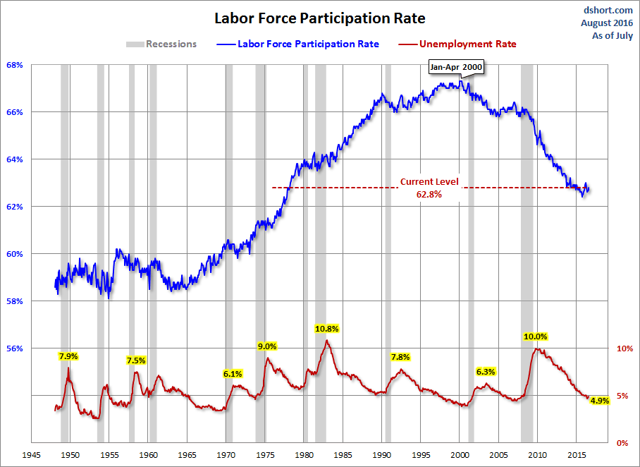
For a confirming view of the secular change the US is experiencing on the employment front, the next chart illustrates the labor force participation rate. We're at 62.8%, up 0.1% from last month.
The employment-population ratio and participation rate will be interesting to watch going forward. The first wave of Boomers will continue to be a downward force on this ratio. The oldest of them were eligible for early retirement when the Great Recession began, and the transition of the Boomer cohort to full retirement age won't end until 2030.
What is the average length of unemployment? As the next chart illustrates, we are perhaps seeing a paradigm shift — the result of global outsourcing and efficiencies of technology. The post-recession duration of unemployment remains high at 28.1 weeks, although that's well off the 40.7-week all-time high in late 2011.

The Bureau of Labor Statistics' broadest measure of unemployment is the U6 series, which includes the total unemployed, plus all marginally attached workers plus total employed part time for economic reasons. This series dates from 1994.

The U6 series continues to show improvement and is now just a tick above its post-recession low. However, it remains above its 9.1% average between the last two recessions.
Notes: The start date of 1948 in the charts above was determined by the earliest monthly employment data collected by the Bureau of Labor Statistics. The best source for the historic data is the Federal Reserve Bank of St. Louis.
The S&P Composite is a splice of the S&P500, which started in 1957, with the S&P 90, which preceded it.


