Figure 1 shows the huge increase in world energy consumption that has taken place in roughly the last 200 years. This rise in energy consumption is primarily from increased fossil fuel use.
Figure 1. World Energy Consumption by Source, Based on Vaclav Smil estimates from Energy Transitions: History, Requirements and Prospects together with BP Statistical Data for 1965 and subsequent
With energy consumption rising as rapidly as shown in Figure 1, it is hard to see what is happening when viewed at the level of the individual. To get a different view, Figure 2 shows average consumption per person, using world population estimates by Angus Maddison.
Figure 2. Per capita world energy consumption, calculated by dividing world energy consumption shown in Figure 1 by population estimates, based on Angus Maddison data.
On a per capita basis, there is a huge spurt of growth between World War II and 1970. There is also a small spurt about the time of World War I, and a new spurt in growth recently, as a result of growing coal usage in Asia.
In this post, I provide additional charts showing long-term changes in energy supply, together with some observations regarding implications. One such implication is how economists can be misled by past patterns, if they do not realize that past patterns reflect very different energy growth patterns than we will likely see in the future.
World per Capita Energy Consumption
Let’s look first at Figure 2. Prior to 1900, energy per capita did not rise very much with the addition of coal energy, suggesting that the early use of coal mostly offset other fuel uses, or permitted larger families. There was a small increase in energy consumption per capita during World War I, but a dip during the depression prior to World War II.
Between World War II and 1970, there was a huge ramp-up in energy consumption per capita. There are several reasons why this might happen:
- During this period, European countries and Japan were rebuilding after World War II.
- There was a need to find jobs for returning US soldiers, so that the country would not fall back into the recession it was in prior to World War II.
- The US had a large oil industry that it wanted to develop, in order to provide jobs and tax revenue.
- Major infrastructure development projects were put into place during this period, including the Eisenhower Interstate System and substantial improvements to the electrical transmission system.
- To facilitate purchases both by companies and by consumers, the government encouraged the use of debt to pay for the new good. Figure 3, below, from my post, The United States’ 65-Year Debt Bubble, shows that non-governmental debt did indeed rise during this period.
Figure 3. US Non-Governmental Debt, Divided by GDP, based on US Federal Reserve and US Bureau of Economic Analysis data.
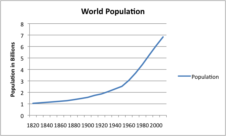
World population also expanded greatly during the period from 1820 to 2010:
Figure 4. World Population, based primarily Angus Maddison estimates, interpolated where necessary.
Figure 4 shows that there is a distinct “bend” in the graph about 1950, when population started rising faster, at the same time that energy consumption started rising more quickly.
If we look at 10-year percentage changes in world population and energy use, this is the pattern we see:
Figure 5. Decade percentage increases in energy use compared to population growth, using amounts from Figures 2 and 4.
Figure 5 shows that the first periods a large percentage increases in energy use occurred about the time of World War I. A second spurt in energy use started about the time of World War II. Population increased a bit with the first spurt in energy use, but did not really take off until the second spurt. Part of the population rise after World War II may be related to the invention of antibiotics–Penicillin (1942), Streptomycin (1943), and Tetracycline (1955). Use of energy to upgrade water and sewer services, and to sterilize milk and to refrigerate meat, may have made a difference as well. Life expectancy in the US grew from 49 in 1900 to 70 in 1960, contributing to population growth.
Since 1970, the rate of increase in world population has declined. One reason for this decline may be the use of oral contraceptives. These were first approved for use in the United States in 1960. Other reasons might include more education for women, and more women entering into the paid work force.
A person can see that in the most recent decade (2000 to 2010), per capita energy use is again rising rapidly. Let’s look at some detail, to see better what is happening.
Detail Underlying Growth in World Energy
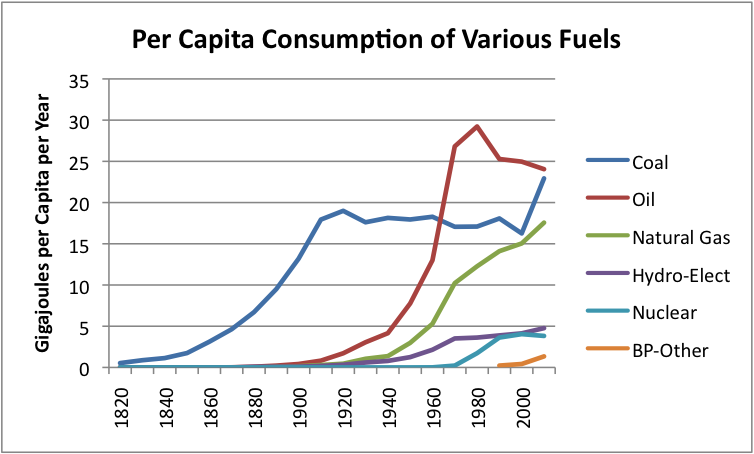
Figure 2 above shows energy from the various fuels “stacked” on top of each other. It is easier to see what is happening with individual fuels if we look at them separately, as in Figure 6, below. In Figure 6, I also make a change in the biofuel definition. I omit broadly defined biofuels (which would include animal feed and whale oil, among other things) used in Figure 2, and instead show a grouping of modern energy sources from BP statistical data. What I show as “BP-Other” includes ethanol and other modern biofuels, wind, geothermal, and solar.
Figure 6. Per capita consumption of various fuels, separately, rather than stacked, as in Figure 2.
We can see from Figure 6 that per capita consumption of oil peaked in the 1970 to 1980 time period, and has since been declining. The fuel that has primarily risen to take its place is natural gas, and to a lesser extent, nuclear. Substitution was made in several areas including home heating and electricity generation.
Coal consumption per capita stayed pretty much flat (meaning that coal consumption rose about fast as population growth) until the last decade, namely the period after 2000. In the period since 2000, there has been a huge rise in coal consumption in China and in other developing nations, particularly in Asia. This increase in coal consumption seems to be related to the increase in manufacturing in Asia following the liberalization of world trade that began with the formation of the World Trade Organization in 1995, and the addition of China to the organization in 2001.
If we look at per capita energy consumption since 1965 by country based on BP data, we find very different patterns:
Figure 7. Per capita energy consumption for selected countries, based on BP Statistical Data energy consumption and Angus Maddison population estimates. FSU refers to the Former Soviet Union. Europe refers to a list of 12 large countries.
Figure 7 shows that since the 1970s, energy patterns have patterns have varied. US energy consumption per capita has declined, while Europe’s energy consumption per capita has tended to remain relatively flat. China’s energy consumption per capita has greatly increased in recent years. The passage of the Kyoto Protocol in 1997 may have contribute to rising Asian coal consumption because it encouraged countries to reduce their own CO2 emissions, but did not discourage countries from importing goods made in countries using coal as their primary fuel for electricity.
Correlations with Employment
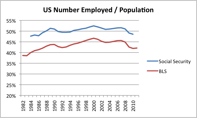
If we look at the United States line on Figure 7, we can see that the most recent peak in US per capita consumption of energy was in the year 2000. It is striking that the percentage of the US population with jobs also peaked in 2000 (Figure 8).
Figure 8. US number of people employed divided by population. Two series are shown: One is for non-farm employment from the Bureau of Labor Statistics; the other is from the Social Security administration.
A person would expect energy consumption to be correlated with the number of jobs for a couple of reasons. First, jobs often involve using vehicles or machines that require fuels of some sort, so the jobs themselves require energy. In addition, people with jobs have the income to buy goods that require energy. Thus, the fact that people in the US have jobs raises the demand for goods and services requiring energy.
If we look at US median wages through 2010 from the Social Security administration, we see a flattening since 2000, and an actual decrease in inflation adjusted wages since 2007 (Figure 9):
Figure 9. US Median Wages based on Social Security data.
If changes in international trade caused US wage earners to be more in direct competition with wage earners from other countries, it would not be surprising if a smaller percentage of the US population has jobs, and that median wages dropped in real terms between 2007 and 2010.
Annual per Capita Increases in World Energy Consumption
Figure 10 (below) shows world per capita energy consumption on a year-by-year basis, similar to Figure 7.
Figure 10. Year by year per capita energy consumption, based on BP statistical data, converted to joules.
Figure 10 shows that world per capita energy consumption was increasing until the late 70s, hitting a peak in 1977. There was a fairly long period until about 2000 where per-capita energy consumption was on a plateau. This was a period where consumers were shifting from oil to electricity where possible, a process that was typically more efficient. It was only in the last decade when production goods of many sorts started shifting to Asia and living standards in Asia starting rising that world energy consumption per capita has again begun increasing.
CO2 Emissions per Capita
I wrote a couple of posts earlier about why CO2 emissions seem to be rising as fast as GDP since 2000 (Is it really possible to decouple GDP growth from CO2 emissions growth? and Thoughts on why energy use and CO2 emissions are rising as fast as GDP), and the increase in per capita consumption would seem to be related. One of the graphs from the second post is shown below as Figure 11.
Figure 11. Carbon dioxide emissions by the three major areas described (Southeast Asia, Middle East, Remainder), based on BP Statistical Data
These emissions are not on a per-capita basis, but the graph illustrates what happens when the production of goods and services is increasingly outsourced to Asia, where coal is used as the primary fuel. Emissions tend to rise there, even if they remain flat in other countries.
If we compare the growth of CO2 emissions and the growth of energy use, both on a per capita basis (Figure 12), we see that the CO2 emissions grew more slowly than energy consumption in the 1970 to 1990 period, so the lines increasingly diverged.
Figure 12. Per capita energy consumption and CO2 emissions, based on BP statistical data.
This divergence appears to result from the changing fuel mix (more nuclear and more natural gas, relative to coal) during the period. Since 2000, the two lines are approximately parallel, indicating no further CO2 savings given the greater use of coal again. Wind and solar contributions are not large enough to make an appreciable difference in CO2 levels.
How an Economist Might Be Misled
If an economist views the period between World War II and 1970 as “normal” in terms of what to expect in the future, he/she is likely to be misled. The period of rapid energy growth following World War II is not likely to be repeated. The rapid energy growth allowed much manual work to be performed by machine (for example, using a back hoe instead of digging ditches by hand). Thus, there appeared to be considerable growth in human efficiency, but such growth is not likely to be repeated in the future. Also, the rate of GDP growth was likely higher than could be expected in the future.
Even the period between 1980 and 2000 may be misleading for predicting future patterns because this period occurred before the huge increase in international trade. Once international trade with less developed nations increases, we can expect these nations will want to increase their energy consumption in any way that is possible, including using more coal.
Another false inference might be that per capita oil consumption has declined in the past (Figure 6), so future declines should not be a problem. For one thing, the past drop in oil availability may very well have contributed to the employment issues noted above during the 2000 to 2010 period in the United States. For another, oil issues may very well have contributed to the Iraq war, and even to World War II. Furthermore, there may be Liebig’s Law of the Minimum issues, because most vehicles use gasoline or diesel for fuel and cannot run without it. Figure 2 also illustrates that a transition from one fuel to another takes many, many years–we have not at this point transitioned from away coal, and nuclear is still only a small percentage of world energy consumption.
The small amounts of new renewables to date should be of concern to economists if they are counting on these for the future. For one thing, ramping up new renewables to amounts which can be expected to make a significant contribution is likely to take many years. For another, new renewables require fossil fuels for their creation, so they are very much tied to the current system.
The fact that things haven’t fallen apart so far doesn’t give the assurance that things never will fall apart. Individual countries behave very differently. While some countries may continue to grow using coal, other countries will flounder when hit by high oil and natural gas prices. It is quite possible that some countries will encounter major difficulties in the years ahead, even though they have so far been untouched. The precarious debt situations of a number of countries leave them vulnerable to disruptions.
Source: Our Finite World


