


Understanding the relative scale of various components in our economy is critical if we want to be able to forecast the impact of changing conditions. Without knowing how the small puzzle pieces fit together to form the bigger picture, there’s a good chance we may overreact to irrelevant information, or be too complacent when critical changes are upon us.
A good example of this that has been discussed recently is China. The ongoing transformational slowdown in China came to the forefront last August when China devalued their yuan. Without realizing that China had allowed the yuan to appreciate for the past decade, making the devaluation more benign, many market participants immediately assumed that China was in trouble, and US economy was doomed.
While China plays an outsized and critical role in the overall economy, in terms of direct trade, China only accounts for 7 percent of total US exports, which is less than 1% of GDP. As far as corporate profits, US multinational companies derive only 2% of their net income from China. And with regard to banking exposure, China represents less than 1 percent of US banking system assets (according to Wells Fargo).
In this context, a China slowdown certainly warrants a cautionary eye, but perhaps not the bout of panic selling that it elicited. After all, China’s growth rate is slowing, but it is still growing, and boasts arguably the best growth rate of any large economy, somewhere between 5-7%.
[Check out: Worth Wray on China's Failed Plan to Blow Stock Market Bubble and Attract Global Investors]
Now to be fair, there are many 2nd and 3rd order effects that can have dramatic impacts on this microcosm of chaos theory that we call a global economy. But nevertheless, understanding the relative scale of economic components will always make for better decision making.
Moving on, I’d like to briefly discuss the US economy from the view point of manufacturing vs. non-manufacturing (services).
The Institute for Supply Management (ISM) puts out a series of highly watched indicators that aim to keep us abreast of changes in these components of our economy. Two of the most popular are the Manufacturing PMI (or Purchasing Managers Index). And the Non-manufacturing Business Activity Index.
You can see both these indexes in the chart below, and for both indexes 50 marks the midpoint between contraction and expansion.
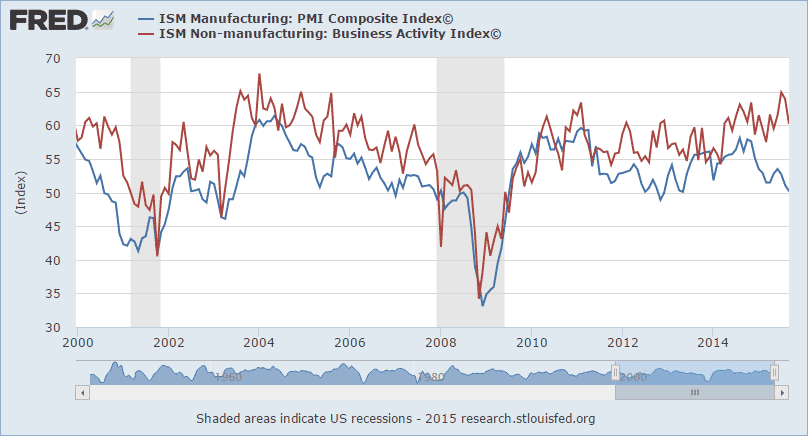
Do you notice the recent divergence?
The manufacturing index, while still technically above 50, indicating expansion, has been slowing ever since the dollar began to strengthen. This makes sense because a strong dollar depresses domestic manufacturing in two ways: it reduces overseas demand for our goods, and it makes importing goods cheaper, and thus a better alternative than manufacturing those goods ourselves.
The non-manufacturing index, on the other hand, is showing solid expansion and is trending higher, not lower. With services a bit more insulated from international developments and exchange rates, this signals that segments of our economy are doing just fine and are exhibiting solid growth.
With manufacturing waning and service activity booming, you may naturally be wondering which is more important to our overall economy.
[You may also like: Jobless Claims, Leading Economic Indicators Still Not Warning of Recession]
While the US used to be a manufacturing powerhouse, those times are long gone. According to the CIA’s World Factbook, approximately 80% of US economic output comes from the service sector. This figure is backed by the US Department of Commerce.
Employment figures show the same distortion. In 2008 more than three quarter of US jobs (77.2 percent) were in the service sector. That figure is rising. As of 2012, the Bureau of Labor Statistics (BLS) attributed 79.9 percent of employment to the service sector.
Does this perspective change how you interpret the chart above? It should. Services account for the vast majority of US economic output, and the service sector of our economy is performing well.
Keep this breakdown in mind when you look at other data, such as today’s release on Industrial Production. The chart below shows the year-over-year change and as you can see, industrial production is showing almost zero growth.

But this is really just a proxy for manufacturing, and you know that manufacturing is a) only 1/5 of our economy and b) dealing with the headwinds of a stronger dollar and lower commodity prices (which may be slowly abating).
Understanding how the breakdown between manufacturing and services has evolved over time should help you to filter incoming data more accurately. It should also help provide a subjective read on when the economy may be headed into recession, accompanied by a severe bear market.
If you look at the first chart in this article again, you’ll notice two vertical gray bars that represent the last two economic recessions. In both cases, manufacturing AND service activity were trending down for years heading into each recession. How do things stand currently?
Manufacturing is of course showing signs of deterioration, but its much bigger brother, the service sector, is bucking the trend and heading higher. Because services represent such an overwhelmingly large portion of our economy, the divergence here favors continued economic expansion. My read suggests that while the global framework is delicate and troubled, the US remains on solid footing.
The preceding content was an excerpt from Richard Russell's Dow Theory Letters. To receive their daily updates and research, click here to subscribe.


