


The first nine charts are assembled from data published in the Federal Reserve Board's Z.1 release of Flow of Funds Accounts of the United States. The data for the first quarter of 2011 was released on June 9, 2011, so the charts reflect data through March, 2011.
The following six charts look at items form the Balance Sheet of Households and Nonprofit Organizations.
Chart 1
"Revised" Net Worth peaked in the second quarter of 2007 at $65.796 trillion. It bottomed at $49.397 trillion in the first quarter of 2009, down $16.399 trillion or 24.92%. In the last eight quarters, it has risen $8.661 trillion to $58.058 trillion. Said another way, Net Worth is still down 11.76% from its peak, but is up 17.53% from its bottom.

Chart 2
The Net Worth/GDP Ratio (3.87) is now back to a level slightly above the level that defined the upper end of the range (3.70) from 1952 to 1995.

Chart 3
Household Real Estate peaked in the fourth quarter of 2006 at .733 trillion. The value at the end of the first quarter of 2011 is .112 trillion, down .621 trillion or 29.12%.

Chart 4
Owner's Equity in Real Estate peaked in the first quarter of 2006 at .504 trillion. The value at the end of the first quarter of 2011 is .124 trillion, down .381 trillion or 54.65%.

Chart 5
Home mortgages (.988 Trillion) account for 75.26% of Total Credit Market Instruments Owed (.271 Trillion).

Chart 6
Credit Market Instruments Owed peaked in the third quarter of 2008 at .909 trillion. The value at the end of the first quarter of 2011 is .271 trillion, down __spamspan_img_placeholder__.638 trillion or 4.58%.

The following three charts look at Credit Market Debt – Total, Financial and Domestic Nonfinancial.
Chart 7
Total Credit Market Debt Outstanding at the end of 1Q 2011 was .603 trillion, down __spamspan_img_placeholder__.125 trillion or 0.24% from the record high of .728 at the end of 1Q 2009.
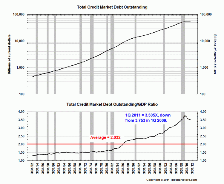
Chart 8
Financial Debt Outstanding peaked in the fourth quarter of 2008 at .123 trillion. It was .104 trillion in 1Q 2011, down .019 trillion or 17.63%.

Chart 9
Domestic Nonfinancial Debt Outstanding reached A NEW RECORD HIGH of .333 Trillion at the end of 1Q 2011! There has been a slowdown in the growth rate, but no "deleveraging" has taken place in this sector.

The following six inflation adjusted charts use the Warren and Pearson's price index 1861 to 1912 spliced to the Consumer Price Index - All items (NSA) in January 1913 for the inflation adjusted calculation.
Chart 10
We see some "secular" cycles in this chart of the "Real" S&P Composite.

Chart 11
The down slope of the current cycle for the Dow Industrials is not as steep as the two earlier ones, but it still qualifies as a secular cycle.

Chart 12
The "Real" Dow Jones Transportation Average has a much different shape than either the S&P Composite or Dow Industrials.
![]()
Chart 13
The "Real" Dow Jones Utilities Average has never taken out its 1929 high.

Chart 14
The "real" price high for Gold at the peak in January, 1980 based on calculations at the end of May, 2011 is 2,457.20.

Chart 15
The "real" price high for Silver at the peak in January, 1980 based on calculations at the end of May, 2011 is 138.76.


