


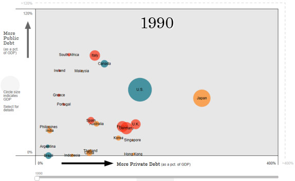
One of the more fascinating ways to visualize the world’s growing pile of public and private debt comes via this interactive graphic in the online version of today’s Wall Street Journal story Asia Goes on a Debt Binge as Much of World Sobers Up ($) where you can view a time lapse of debt (as a percentage of GDP) for various countries and regions.
The basic story is told in the two charts below, the first being from 1990:
The second from last year:

The article is a good read, but the interactive graphic is really something as you can isolate countries and regions such as the U.S., Greece, Japan, etc. to see how conditions have changes over the last 20+ years, particularly since the 2008 financial crisis.
Source: Iacono Research


