


We’re going to look at a bunch of economic data today, but before we do, there’s something we need to clear up. Most economic data is released in a monthly cadence, but if you focus on monthly figures, you’re going to misinterpret a lot of information.
Here’s a classic example, using industrial production. This chart shows month-over-month changes in industrial production – the metric that most economic calendars will provide. This is also typically how you’ll hear the data reported in the financial media.
Interview Inflation – It’s All a Coin Toss
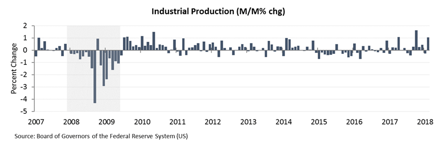
But, as you can see above, making any type of inference from this data is nearly impossible. Not only is the data incredibly volatile from one month to the next, providing no indication of the broader trend, but the time frame in question is simply too short to be meaningful.
As a long-term investor, if you make investment decisions based on monthly data, you’re going to be constantly arriving at different conclusions. Last month, for example, you might be pleased by the 1.1% bump in IP, but the prior month, you would have been frustrated by the 0.3% decline. What’s the real trend … up or down?
Now take a look at the following chart, which shows the exact same data as above, but on a year-over-year basis.

This chart is nothing more than a different permutation of the data shown in the first chart, but as you can see, viewing the data this way allows for a much better understanding of the underlying trend. Now you can easily see that industrial production in the US has seen solid improvement over the past two years and is currently 4.4% above year-ago levels.
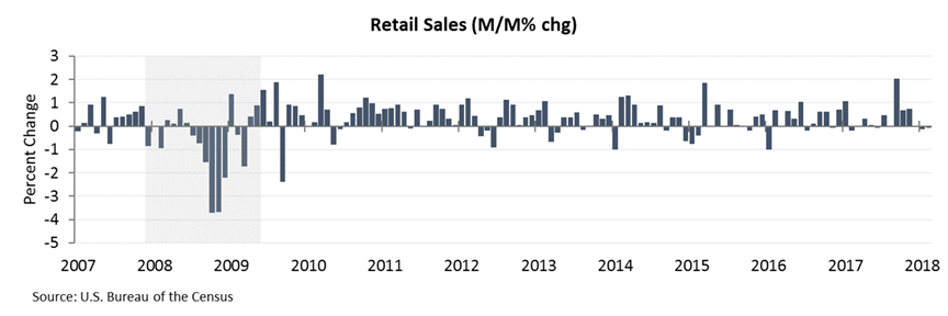
Let’s look at another example, this time retail sales.
Here’s the monthly data. It’s difficult to tell in the chart, but the last three monthly readings were -0.05%, -0.12%, and -0.07%. Three months of declining retail sales in a row? The country must be headed for recession!
But once again, if we rearrange our data to filter out the noise and give us an indication of the broader trend, we end up with a totally different picture.

Viewed on a year-over-year basis, we can see that retail sales are not quite as bad as the monthly data suggests. In fact, it’s up 4.0% from last year. Can you really expect much more out of a 2-3% economy?
I can’t speak for others, but this is why when you read my columns, you’ll find predominantly YoY data. I could try to elicit an emotional reaction out of you by talking up changes in the monthly figures (as the financial media is accustomed to doing) but I believe that’s doing you a disservice. My goal is simply to provide you with a foundational perspective of the data from which to make your investment decisions, and that’s all.
Speaking of, let’s check in on some of the other areas of the economy to get a more complete picture of how things stand.
Here are durable goods orders, split up into three categories: total durable goods, durable goods ex-transportation, and core capital goods. Looking at these three cross-sections allows us to filter out any anomalous readings in one particular area of the economy.

As you can see, these measures of durable goods are up 7.0%, 7.0% and 6.3%, respectively, on a year-over-year basis. That represents solid growth, and reinforces the strength that we’re seeing elsewhere.
How about the consumer? Is he or she “tapped out” as many analysts like to suggest? You tell me.
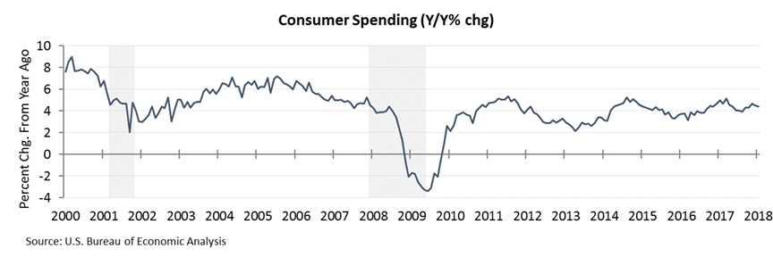
Consumer spending through January was up 4.4% above year-ago levels. Once again, for a 2-3% economy, I personally don’t think you can ask for much more.
One last chart before we switch gears a bit … Below you can see the change in total nonfarm payrolls (jobs) per month. Keep in mind that this chart is not showing month-over-month growth, as with our monthly charts above, but rather actual monthly data.
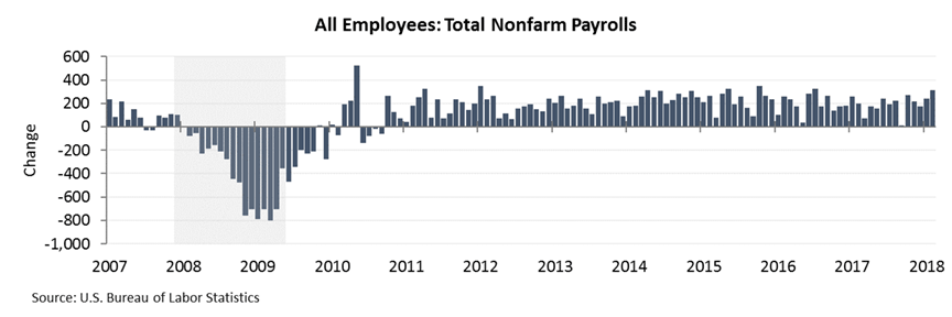
Our economy has been a consistent job creator for over eight years now, and we still don’t really see any signs of slowing. This is important because, with each new job that’s created, we see a boost in consumer spending, retail sales, etc. In other words, every job created adds additional demand to the economy, which stimulates commerce.
If you look to the left side of the chart above, you’ll see the deterioration in job creation that occurred prior to the financial crisis. Eventually, we’ll see this same pattern occur again, as the economy begins to top out, but so far job growth remains robust.
Now let’s change topics for a moment and look at housing. We rarely talk about housing (since we mostly focus on paper assets – except precious metals, of course) but from an economic perspective, housing is important because it’s always providing either a headwind or a tailwind.
Right now that tailwind is strong – blowing at about 6.4%. In other words, home prices across the country are rising by roughly 6.4% per year. That marks a subtle acceleration from the growth rate we saw over the last couple of years.

Higher long-term rates, combined with repercussions from the tax changes (such as the mortgage interest deduction cap) may slow the growth in home prices, but at the moment, US homeowners are seeing strong appreciation. This translates into improving balance sheets for homeowners and results in an increased propensity to spend and invest among those who own property.
At this point, it should be relatively clear that the economy is on a sturdy footing. But unfortunately, the financial markets don’t care about where the economy is now, they care about where it’s heading. As you can see above, very few of the data points we’ve looked at (with the exception of durable goods orders and perhaps the employment figures) provide any type of advance warning of an approaching recession.
To verify this, notice that prior to the beginning of the recession in 2008, Industrial Production, Retail Sales, and Consumer Spending were all seeing relatively strong year-over-year growth. So what was it that sunk the economy? And where could we have received an advance warning?
Obviously, the 2008 meltdown was triggered primarily by the subprime mortgage mess, but in terms of the primary components of GDP (consumer spending, government spending, business investment, and net exports), it was (and usually is) a contraction in private domestic business spending that puts us into recession.
Notice in the chart below that private domestic investment had seen a major slowdown and was actually contracting, well before the recession hit. In other words, businesses had already recognized the deteriorating conditions and were pulling back on capital outlays.

In fact, if you look back through time (see chart below), you’ll notice an interesting pattern in which private domestic investment (aka business spending) went negative prior to just about every recession we’ve had.
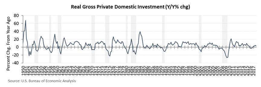
Based on this, you might be tempted to try to use business spending as a leading indicator for economic recessions, and therefore major market turning points. But this is ill-advised for two reasons. First, as you can see above, there are many “false positives” when it comes to business spending – the most recent one came in late 2015/early 2016.
The other problem is that gross private domestic investment data is only released quarterly, with the GDP report. This means that the data is always late. By the time it’s finally released, the data is almost worthless because market participants have already discounted it using other datasets (as proxies) that come out on a more timely basis.
I’m sure you can see where I’m heading with all of this because I talk about them often: leading economic indicators.
Of all the economic datasets out there to parse, there are really only a few that are valuable. These are dubbed leading economic indicators, because – believe it or not – they tend to lead the economy. These include items such as initial jobless claims, average weekly hours worked, various measures of “new orders,” building permits, and measures of consumer expectations, among others.
It is these components that provide the best insight into how the economy is evolving, and therefore how the financial markets are likely to move. And as I pointed out last week, leading economic indicators are still pointing UP.
We’re getting long so I want to wrap up with a few last charts. Besides changes in leading economic indicators, the other items we need to stay apprised of are general financial conditions, primarily involving access to credit. As we saw with the subprime crisis, a slowdown or deterioration in credit can quite literally tear apart the fabric of the global economy.
There are a variety of financial stress indexes that I monitor, and you can see some of these in the charts below.

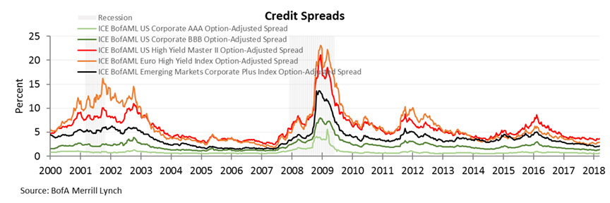

The takeaway here is that although we’ve seen a minor bump in some of these measures due to Treasury bill issuance and the prospect of major deficit spending, overall financial conditions still remain quite favorable. Let’s see if that continues to be the case as trade negotiations unfold…
The preceding content was an excerpt from Dow Theory Letters. To receive their daily updates and research, click here to subscribe. Matt is also the Chief Investment Strategist at Model Investing. For more information about algorithmic based portfolio management, click here.


