


Back in early February, in the midst of the most vicious selloff we’ve seen in years, I showed the chart below and made the case that we were seeing a “minor blow-off top in the context of a continuing primary bull market.” Today I’d like to update you on that view.
My February comments were based on two main factors: we had just experienced a two-month long explosive momentum-based rally, and the economy remained on steady footing. The combination of these factors left me with the impression that stocks would eventually work themselves higher, but it would take a while. I did not, however, expect it to take quite this long…
In the chart below, which is from my February 5th column, we can see that my green, haphazardly placed regression line closely matches the slope of the 200-day moving average. These two lines provided an indication of the primary trend of the stock market.
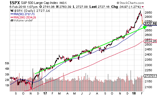
But as you can see, we had a strong finish to 2017, and then stock prices soared another 7% in January, taking us WAY above both the 200-day MA as well as our line of best fit. In effect, we were overbought and overextended … things were looking too darn rosy.
As with nearly all periods of exceptional price appreciation, this move was unsustainable. The market had simply run too far, too fast.
The subsequent correction then did what nearly all corrections do, it overshot to the downside before rebounding higher. We can see this action, as well as all of the price action since February, in the chart below.

What I’ve attempted to do with this chart is create a regression line through the price action we experienced prior to the blow-off top (central blue line) and then continue that line forward using the green arrow.
When viewed this way, we notice a couple of interesting things. First, from the point at which prices began accelerating away from the central regression line (beginning in December 2017), prices spent about four months above our continued regression line (shown in green). Since then, we’ve spent about four months below that line, and we also continue to track upward at about the same slope.
Also, notice that periods, when prices dipped below the 200-day MA, were fleeting – as we would expect during a primary bull market – and also that the slope of the 200-day MA remains relatively unchanged. This is important because as discussed two Friday’s ago, the 200-day MA cuts through a lot of the noise to show us the longer-term trend – which remains up.
Now let’s zoom in and look at the price action in the S&P since we had the blow-off top. This chart shows seven months’ worth of prices, and we have some recent bullish developments.
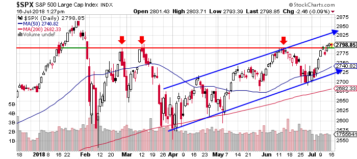
First, the rising channel that the S&P has been in since the beginning of April remains intact. Second, as of the end of last week, we popped above a very strong level of resistance near 2790 (red horizontal line). If prices can remain above that level, it leaves the S&P open for a run at the January highs.
Will we see that come to pass?
In my opinion, I do believe we will see the S&P retake its high-water mark (pending no explosions – literally or figuratively – with trade talks, North Korea, Russia etc.) but it may take another month or two. If you go back and look at the second chart above, you’ll notice that if prices had simply remained on their 2017 trend (followed the green arrow), they would have reached the January peak level sometime around August or September. That still remains a possibility.
The other reason I believe the S&P will eventually retake its high water mark is because we’ve already seen many other major averages accomplish the same feat. In the charts below, we can see that both the Nasdaq (top), as well as the Russell 2000 (bottom), have been well above their respective January peaks for some time now.
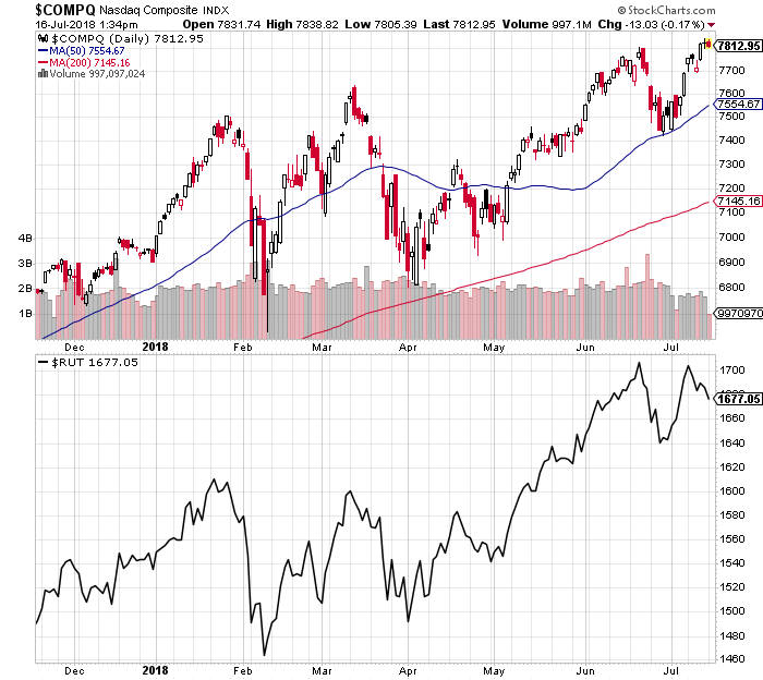
As we discussed in last Friday’s article, about as many issues trade on the Nasdaq as the NYSE (more if we compare just common stocks). So when we see the Nasdaq composite hitting new highs, it means a major chunk of the total stock market is still firing on all cylinders.
When we combine that with the fact that the NYSE advance-decline line is also setting fresh record highs, it tells us that just about everyone is kicking ass and taking names except for the big multinationals that are held hostage by trade concerns … And wouldn’t you know, these are the same companies that make up the major averages such as the Industrials, Transports and S&P 500.
So to circle back, yes – I do believe the thesis originally set forth in February remains intact today. Unless our collective leaders decide to start lobbing economic grenades at one another, we should once again see new highs across the board.
One thing to keep in mind, however, is that the US is weathering this whole trade war thing much better than our trading partners are. In the chart below, courtesy of the WSJ, we can see that the S&P is up for the year, but other markets are not. While the S&P has risen 5%, China’s Shanghai Composite has fallen nearly 15%.

If you’re wondering why one of the primary reasons has to do with the fact that the US still buys most of its stuff from ourselves. Our country is driven predominately by consumer spending, whereas many other countries are not. Exports remain extremely important to Germany, South Korea, and China, but less so for us.
As an example, according to Goldman Sachs, exports to China make up only 1% of US GDP. So tariffs or no tariffs, our multinational corporations are likely to see continued growth. In the crazy event that we actually end up with better trade deals than we started with (an outcome I believe very few are pricing in), who knows … we could see a surge higher.
Most corrections don’t last this long, but then again corrections have been rather unusual lately. We really didn’t have a correction during our incredibly prosperous 2017, and when you consider what this correction is really about – a renegotiation of world trade – the fact that it’s taking a long time to play out makes sense.
The preceding content was an excerpt from Dow Theory Letters. To receive their daily updates and research, click here to subscribe. Matt is also the Chief Investment Strategist at Model Investing. For more information about algorithmic based portfolio management, click here.


