


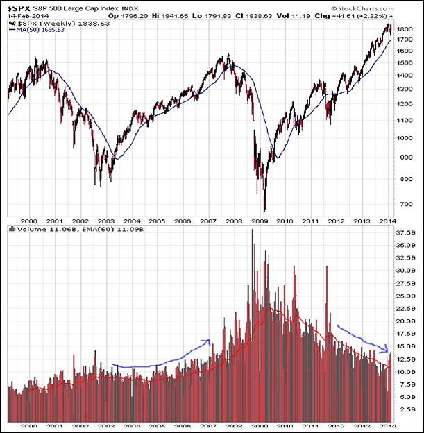
Everyone is fully aware that the current equity market cycle has been characterized by lack of expanding volume. Is this why the current environment has been described as the rally no one believes? Or the most hated rally in recent memory? The following chart tells the story quite elegantly.
[Don't Miss: One-on-One With Jim Puplava: Super Bowl Stock Strategy – Lessons Learned; The Power of a Good Defense]
Historically, we have seen the greatest spikes in aggregate volume occur at the outset and through entire equity bear markets, with the largest spikes near or at very meaningful price lows. Kind of turns buy low and sell high on its proverbial head, does it not? But what has been true of equity bull markets past is that volume picks up incrementally as the bull plays out. Quite naturally, for many higher price engenders a higher level of confidence, hence a higher level of volume commitment. We saw this exact incremental growth in volume from 2004 through 2007, prior to the spikes in volume in 2007 and 2008 on downside price volatility that were the key indicator precursors to the large 2007-2009 bear. Again, the character of historic equity bulls is “incremental” expansion in volume.
But as mentioned, and as is clear in the above chart, expansion in volume (even incremental) has been lacking in the current bull run. The huge volume spikes seen in 2010 and 2011 came with meaningful price corrections. No surprise as the memory of 2008 was very fresh. From 2012 until present we have witnessed steady erosion in volume as price has moved up over 40%. Interestingly, the correction of the last three weeks again witnessed volume accelerate to the upside, but not yet make a yearly or multi-year high. What this tells me personally is that at least over the last few years, we’ve lived in a market environment that is better characterized as “not being sold” as opposed to aggressively “being bought”. Does this say anything at all about pinpoint market timing? Absolutely not. But what it does tell us is that investors have been very willing to sell corrections and not so willing to buy rallies. In fact in recent weeks we again saw a meaningful few weeks outflow from equity mutual funds right into the depths of the correction.
Let’s take a bit of a closer look at the character of volume in the current cycle. In the chart below I’m looking at weekly advancing volume and declining volume on the NYSE. I’m using a 13 week moving average for up and down volume to attempt to smooth the many weekly wiggles and jiggles. Here’s what I find interesting as a character point. I’ve colored in green the periods where upside volume has exceeded downside volume over the entire period. Let’s face it, if volume in the aggregate is not expanding, then we need to drill down into the character of upside versus downside volume at any point in time. This is what I’m trying to get at below.
What stands out to me in the chart is that from 2010 through late 2012, the bulk of equity market price gains occurred when advancing volume exceeded declining volume. If one had “traded” this intersection of expanding volume exceeding declining volume, one would have stayed on the right side of shorter term trends. But as is clear, since November of 2012 (QE3), the equity market has moved higher regardless of whether upside or downside volume has prevailed at any point in time. It’s a change in character. It again tells me it’s a market dominated by investors “not selling” as opposed to “aggressively buying”.
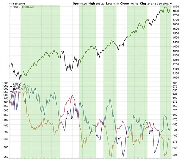
Have we seen equity markets exhibit this type of behavior in the past? You bet. In the prior cycle, we witnessed a 20+% move in the S&P from mid-2006 through mid-2007 where declining volume dominated expanding volume throughout.
From my perspective, an equity market that can move higher in an environment where declining volume exceeds advancing volume can be a warning. But it’s just that for now, a warning to be monitored, not a definitive indicator.
We know the current cycle is quite different than cycles past due largely to domestic and global QE. “Rules” that may have been historically reliable guideposts have been blurred. I’d suggest to you that in the current cycle, any one indicator in isolation can be very deceiving and possible detrimental to your financial sanity. Personally, I prefer to rely on a weight of the evidence approach.
As you’d imagine, I could turn this discussion into reviewing a toolbox of indicators going on for pages. I’ll leave you with a final two to possibly be used in conjunction with the message of volume character above. We’re seeing some warnings in volume. But two key macro indicators I use have not flashed red warnings. First is a longer term look at cumulative daily breadth. In one sense, this is all about price as opposed to volume. I think this is important within the context of a theme that the market is not being sold (based on price) as opposed to being bought (suggesting volume expansion). The 200 day MA of cumulative daily NYSE breadth (advancing issues relative to declining) has been a key longer term macro indicator for well over a decade. We rest at new highs for now. At least historically, a break either above or below the key 200 day MA had been a cause for action. We’re not there yet in the current cycle. The combined message of the advancing versus declining volume charts coupled with what you see below tells me price is more important to investor decision making short term than is volume. The cumulative AD line for the NYSE is about price.

Finally an old tried and true that continues to hold up to this day. It’s a look at the relationship between the 15 and 40 week exponential moving average of the S&P. I will not belabor the discussion as the action points in the chart are clear historically. This very simple rule has kept investors on the right side of the equity market for decades, to be honest. And in the current cycle what is this chart all about? Once again it’s about price.

Maybe the very simple summation comment is that one of the old pieces of market lore (among others) has been turned on its head in the current environment. The old adage is that volume precedes price. Not this time. Not in this cycle. So we place the heaviest weight on macro indicators in the toolbox indicative of price. Volume will ultimately express itself, but most likely when a serious correction or bear is occurring/beginning. It’s a new multi-year high in volume that may be a key warning. But again, we’re not there yet. For now, the price is right—until it isn’t.


