


There are many successful investors who have accumulated decades of experience and have drilled down their pearls of wisdom to insightful lists. One such list, or ten rules to remember, comes from legendary investor Bob Farrell who spent decades at Merrill Lynch & Co. and retired as their chief stock market analyst in 1992. Farrell was voted the top analyst by Institutional Investor magazine in 16 of the last 17 years of his career before he retired for predicting changes in overall stock market direction. His famous ten rules to remember are listed below.
Bob Farrell’s 10 Rules
- Markets tend to return to the mean over time.
- Excesses in one direction will lead to an opposite excess in the other direction.
- There are no new eras — excesses are never permanent.
- Exponential rising and falling markets usually go further than you think.
- The public buys the most at the top and the least at the bottom.
- Fear and greed are stronger than long-term resolve.
- Markets are strongest when they are broad and weakest when they narrow to a handful of blue-chips.
- Bear markets have three stages.
- When all the experts and forecasts agree — something else is going to happen.
- Bull markets are more fun than bear markets.
I want to focus today on Farrell’s Rule #7, which focuses on market breadth. Market breadth deals with how broad a trend is in the stock market or, to put it figuratively, how many troops are following the general up the hill? Moves in which the bulk of stocks (troops) in the market are moving in lockstep with the major indexes (generals) are the strongest according to Farrell while moves in which only a handful of stocks are participating are the weakest and tend to foreshadow a market reversal.
There are many ways to measure market breadth and I want to highlight their usefulness and what the message coming from breadth tells us about the present situation. One method that I use regularly for measuring breadth is 52-week new high and low data. There are two ways in which I use 52-week high/low data, where the first is for spotting shorter-term peaks and troughs and the second is for identifying bull market tops and bottoms.
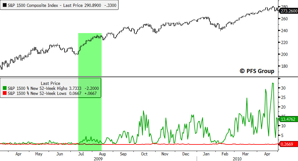
In healthy bull markets and advances, the spikes seen in new 52-week highs should be strong and confirming the move to new highs in the major indexes while at the same time spikes in 52-week lows should be relatively low. During bull markets there are times when new 52-week highs begin to contract while the market powers higher. This development usually occurs just before a market pullback and the 2011 top is a good example. Looking at the S&P 1500, which includes the small cap S&P 600, the mid cap S&P 400, and the large cap S&P 500 and represents roughly 90% of the entire US market cap, shows that new 52-week highs began to expand meaningfully out of the summer 2010 bottom as the markets powered higher. New 52-week highs remained elevated in early 2011 but by spring we began to see a contraction that was warning of an intermediate top in the market. You can see this visually below with the S&P 1500 shown on the top panel and new 52-week highs and lows on the bottom panel.

Source: Bloomberg
You can also use 52-week high and low data for identifying more significant bull market tops and bear market bottoms. Intuitively, during market rallies new 52-week highs will obviously be larger than if the markets were declining and new 52-week lows will be expanding more during declines than rallies. What is key though is looking at the size of spikes in new 52-week highs during rallies in a bull market compared to spikes in 52-week lows during bull market pullbacks. During the process of putting in a bull market top, breadth deteriorates and stocks begin to move into their own individual bear markets beneath the surface while the major indexes move to new highs. Near the market’s peak we see a hand-off between the bulls and the bears in which the spike in new 52-week lows during a pullback exceeds the spike in new 52-week highs during the preceding rally.
To show you what I mean let’s take a look at the last two bull market tops. The markets really took off after the mid-cycle slowdown in 1994 and from 1995 to 1997 the spikes in new 52-week highs during rallies were consistently larger than spikes in new lows during pullbacks as the bulls were in control.
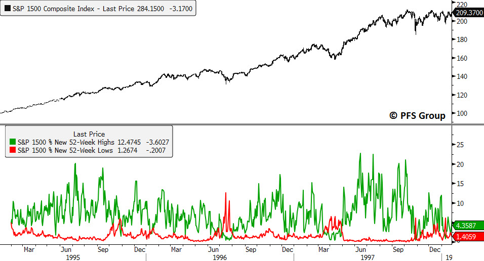
Source: Bloomberg
However, with the collapse in Long-Term Capital Management in 1998 there was a clear shift in market behavior in which the bears finally had the upper hand when the spike in new 52-week lows during the mid-1998 decline exceeded the spike in 52-week highs in the prior rally. This was the handoff between the bulls and bears and the bears maintained control of the market’s internals as breadth continued to weaken until the point where the major market averages that were being dominated by technology stocks finally peaked in 2000.

Source: Bloomberg
Analysis of 52-week high/low data was also helpful in identifying the 2003 market bottom. There were many dead-cat bounces during the 2000-2003 bear market but during these rallies there was not a meaningful expansion in new 52-week highs, and spikes in new 52-week lows continued to dominate. However, with each decline the spikes in new 52-week lows were declining which suggested selling pressure was abating and then by the middle of 2003 we saw a significant increase in new 52-week highs in which the bulls finally regained control of the market and a new bull market began.

Source: Bloomberg
From 2003 on, spikes in new 52-week highs during rallies continued to exceed spikes in new 52-week lows during pullbacks as the bulls maintained control.
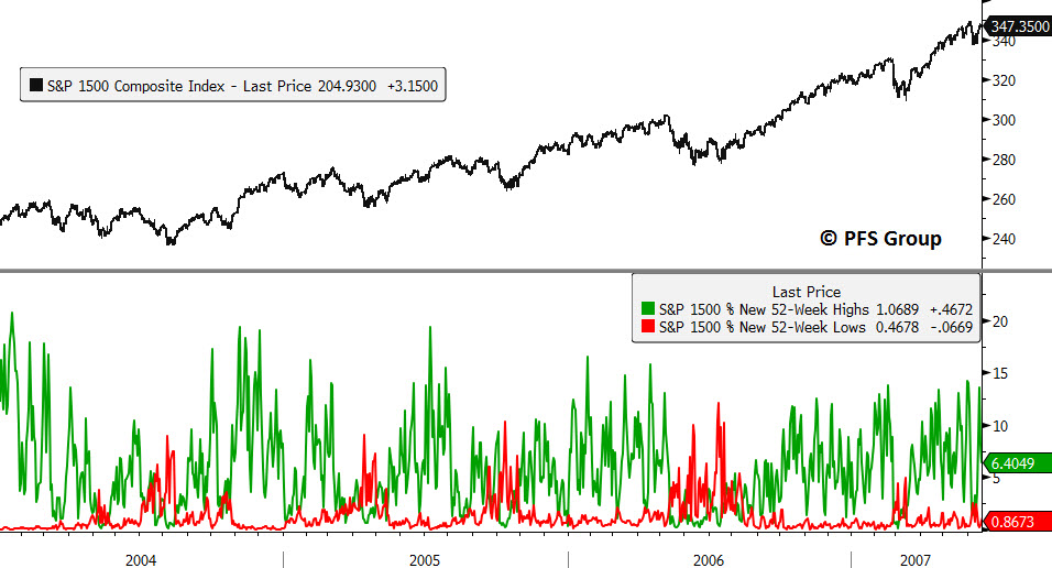
Source: Bloomberg
However, things changed in the summer of 2007 in which during the July to August decline the spike in new 52-week lows exceed the prior spike in new 52-week highs as the bears took control of the market. We saw the strength of the bears building momentum as we entered 2008 as subsequent spikes in 52-week lows continued to increase.
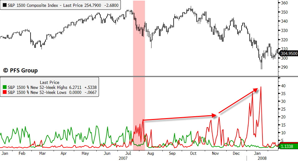
Source: Bloomberg
Selling pressure continued to intensify until October of 2008 when we saw nearly 70% of the S&P 1500 members hitting new 52-week lows during the October decline. However, from October 2008 going forward, spikes in new 52-week lows decreased in size (see blue line below) and a bottom started to form.
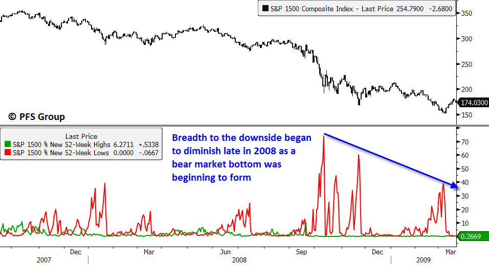
Source: Bloomberg
It wasn’t until June and July of 2009 that we could say with strong confidence that the rally off the March 2009 low was more than just a dead-cat bounce as new 52-week lows failed to expand meaningfully during the June-July pullback. From that point on we saw a spike in new 52-week highs that continued to expand with each rally as the bulls once gain regained control of the market.
Source: Bloomberg
Now that you've seen how useful this data is for identifying the real-time formation of tops and bottoms in the market, let's see what it's telling us now.
When looking at the current situation below we can clearly see that the bulls have been in control of the market as 52-week highs dominate new 52-week lows. However, we are seeing a thinning of the ranks with a contraction in new 52-week highs since late 2013. This contraction in breadth suggests that the market is losing strength.

Source: Bloomberg
Confirming the message of weakening breadth seen in new 52-week highs is the cumulative advance-decline line for the S&P 1500 which has contracted meaningfully while the S&P 1500 rests near all-time highs.

Source: Bloomberg
What the present breadth data tells us is this rally is beginning to narrow and may be foreshadowing a pullback in the near future. It also tells us the bulls still maintain control of the market and so we shouldn’t be expecting a bull market top as new highs continue to dominate new lows. Perhaps when we see clusters of Hindenburg Omens as we did during the 2007 top when breadth significantly deteriorated we should be more concerned of a bull market top. That time is not now as bearish breadth remains weak and there are no Hindenburg Omens being given for the various broad market indices as shown below by the red and orange indicators.

Source: Bloomberg
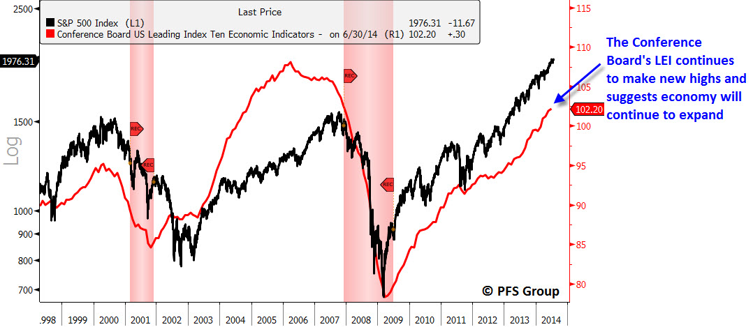
It is probably wise to respect Bob Farrell’s rule #7 regarding breadth in that the present rally is weakening and so investors may want to play it safe currently. However, given a lack of signs of a bull market top and or a top in the leading economic indicators (see below), just don’t get too bearish and run for the hills if equities correct. Rather, given the economy remains on solid footing, any pullback should provide the opportunity to pick up stocks at cheaper levels.
Source: Bloomberg


