


I'm guessing many of you know the answer to this question like the back of your hand. But for those who need a reminder, it's because market breadth indicators represent a way to glean information that is unavailable from looking at the performance of averages such as the Dow, Transports or S&P 500.
Indexes, through the nature of their construction, do not treat all stocks equally. The Dow, for example, which is a price-weighted index, allocates more "weight" to higher priced stocks. The S&P 500, which is a market-cap weighted index, allocates more "weight" to stocks with higher market caps (share price x shares outstanding). Nearly all commonly referenced indexes are one of these two types. Japan's Nikkei is price-weighted while the entire Russell family of indexes, the NASDAQ, Wilshire, Hang-Seng, and EAFE indexes are all "cap-weighted."
Market breadth indicators, on the other hand, treat all stocks evenly. When looking at market breadth, no more or less weight is given to any one stock. This can be beneficial in some circumstances, less-so in others, but ultimately it's a unique view into the markets that can't be seen through any other metrics.
Market breadth allows us to see how the markets are performing as a whole, and measure the degree to which a majority of stocks are participating in the market trend.
[Must Read: Market's Bill of Health – Expect Short-Term Rally Before Final Correction]
It's possible that on any given day the Dow, Transports and S&P 500 are positive, indicating bullishness, when in fact the majority of stocks declined on the day — meaning we should perhaps be wary and view the day's action as bearish. If we didn't look at market breadth, we wouldn't be able to discern this subtle but important information.
Breadth is most commonly used to identify divergences in the market trend. Arguably the most common metric for looking at breadth, and one we rely on heavily at Dow Theory Letters, is the Advance-Decline line.
Here's a prime example of where watching market breadth could have given you a heads up. The two charts below demonstrate a divergence which occurred as the market peaked in 2007, just ahead of the financial crisis. The bottom chart shows the NYSE Composite, which continued making higher highs into late 2007. The Advance-Decline line is shown in the top chart and you can see that during the same time frame, it was making lower highs -- signaling a non-confirmation or divergence of the bullish trend. This signal turned out to be a crucial advance warning.

It would be nice if we were always provided this type of advance warning, but clear indications like this are more the outlier than the norm. Market breadth indicators are simply one tool in a very large toolbox. They come in handy in a some situations and are of little help in others.
Some might be wondering if the A-D line could have helped us anticipate this most recent pullback. The answer, unfortunately, is not really. Below you can see the A-D line in the top chart and the NYSE Composite in the lower chart. Prior to the markets selling off, the A-D line was acting very bullishly, setting multiple new highs in the first few weeks of January and demonstrating strong participation (blue line upper chart). During this period the NYSE Composite was making minimally lower lows (blue line lower chart) but the two data sets combined did not give a clear indication as to whether, or which way, the markets would break. Yes, there was a slight divergence, but in this case breadth was aligned with the inherent trend.
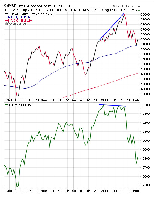
By the way, for those wondering why I'm using the NYSE Composite for comparison instead of say, the S&P 500, the reason is that it makes for a more fair comparison. We're looking at the NYSE Advance-Decline line, so it makes sense to compare it to an NYSE index, not an index like the S&P 500, which includes stocks from other exchanges such as the NASDAQ.
Take a look at the horrific recent performance of copper, or Dr. Copper, as many put it. The "Dr." refers to copper's supposed PhD in economics, stemming from its unique ability to predict turning points in the global economy. Copper is used in nearly all sectors of the economy, from housing and manufacturing to technology and power distribution. Its broad role across all industries makes it a good leading indicator of economic health. When copper demand is heavy, the indications are generally healthy for the global economy, and vice versa. Of course as with all commodities, supply changes can impact the price to a large degree.
China accounts for about 40% of global copper demand, so it makes sense that the latest slide in copper coincided with the release of weak China PMI numbers and the following emerging market turmoil. In this case excess supply appears not be the culprit of lower prices, as Daily London Metal Exchange data shows supplies are at their lowest level in over a year.

The ADP employment report released yesterday showed a slower pace of hiring in January. Only 175,000 jobs were added in the private sector while 189,000 were forecast. This suggests a possible weak non-farm payroll report on Friday, which has the potential to trigger another round of selling.
Below is a chart showing non-farm payroll increases over the past two years. The last reading of 74,000 was the lowest since January 2011. Many wrote it off as an outlier, and in a sense it was given a "free pass." However, another poor reading will not be given a pass, no matter how much people try to blame the weather.

The above content was an excerpt of Richard Russell's Dow Theory Letters. To receive their daily updates and research, click here to subscribe.


