The folks at the Social Security Trust Fund are nice enough to release key data on the broad economy’s performance a month in advance. The payroll tax and benefits numbers for May came out last Friday. This information represents about 150mm workers. So it is even broader than Non Farms payroll (“NFP”) numbers.
These numbers will be revised. There is tricky seasonality. Some months are five weeks, others four. Holidays come into play, especially when they are over a month end. There are also quarterly adjustments. These represent reversals of prior year reported results. (In 2010 there was a downward restatement of prior year revenue of $26b).
Knowing all this I still look at the numbers in the belief they provide valid information on the broader economy and (hopefully) a decent look at the Non-Farms data due out at the end of the week. For what it is worth; my read of the numbers is that the NFP will disappoint and the economy is stalled.
I think of the May data as a baseline for April. If that were to be the case it would give a window to the April NFP. The YoY tax increase is $542mm. Approximately 1.5mm jobs. This would suggest (to me) that the April NFP number is a range of 0 -200,000. So I am all under the Street estimate of +200,000.
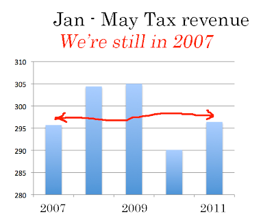
The year to date through May is nothing to write home about either. This looks at the past few years. Yes, tax revenues are up from a year ago, but they are also at 2007 levels. I estimate that the average wage for those who found work in the past five months is less than $30,000.
It’s hard to get excited about this picture. I took a lot of flack recently with the comment that the difference between 2009 and 2011 is that in 2009 there were no “jobs” and there was no “work”. In 2011 there are still no few “jobs” but there is “work.” To some extent the improvement we are seeing is a function of people who can’t find a “job” (teaching) who have been forced to “work” (flipping burgers). So really there is not much improvement at all.
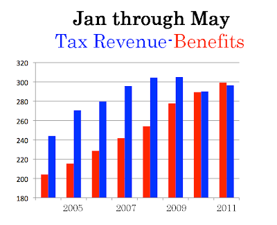
Social Security is continuing to run red ink on the critical ratio of payroll tax revenue to benefits paid. This looks at the first five months over the past few years. Benefits march higher while revenues are flat:
A closer look at the difference between the primary income and expense. The red ink for the five months in 11’ is the first since 1983. Not long ago SS was a cash cow that funded a portion of the federal deficit. Not any longer.
Note:
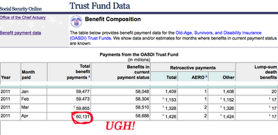
Recently I made note of the benefits paid at SS exceeding billion in a month. I used this slide:
The bean counters at SS revised that number. It’s still above b but 0mm lower than the first estimate:
This is no big deal. It is a 1/8th percent adjustment. Literally, a rounding error. But it struck me funny. How could 1mm be a rounding error? In a month? The answer of course is that the amounts involved are so very large. The Social Security payout is running at .4mm every minute. That comes to thousand every second. And that’s 24/7. And rising.


