House prices in desirable areas are declining, contradicting the "recovery" story.
Without speculating on where housing valuations "should" be, what's your takeaway from these charts of individual home prices? Does this look like a "recovery" to you? Since everyone knows "real estate is local," I selected three homes in very desirable but not overly exclusive neighborhoods with excellent school districts and a history of strong price appreciation: two in Northern California and one in the Greater Boston region.
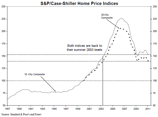
For context, here is the most recent Case-Shiller Index, which shows national home prices declining to 2003 levels. This chart traces a classic "bubble" with the top around the first quarter of 2007, followed by a sharp decline and a period of stabilization as the Federal Reserve and the Federal government intervened to support the housing market in an unprecedented fashion--buying $1.1 trillion in mortgages, issuing tax credits to buyers, etc. etc.
Recently, the index turned down again, the dreaded "double dip."
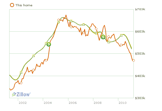
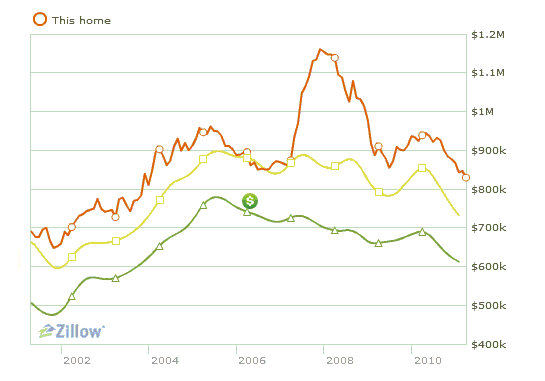
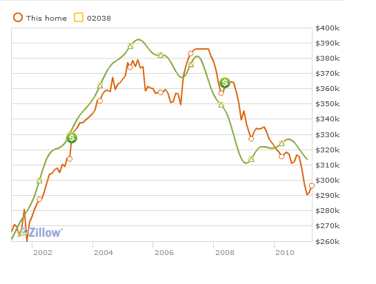
Interestingly, the charts from highly desirable neighborhoods have much different characteristics. The top of the bubble valuations occurred in a timeframe stretching from 2005 to 2008. There was no sharp decline in price, followed by a plateau; prices have dropped grudgingly but steadily from their apex.
Prices are still in a free-fall, and there is still plenty of room left on the downside to fully retrace the bubble. The cliche is that housing prices are "sticky" and decline slowly. While prices have been dropping for a few years, the decline seems to be accelerating rather than stabilizing.
If we had to characterize the difference between the national chart and these left/right coast homes in desirable, upper-income areas, we'd have to say there was not much of a plateau, that price has "only" returned to 2004 levels and that declines accelerated in 2010.
Here is a home that was completely renovated in 2002-3 in a middle-class suburb of San Francisco. The green line reflects the town's pricing history.
This home is in the highly desirable "hills" of a San Francisco-area suburb, a desirability reflected in the bubble valuations above million. The green line is the town's price history, the yellow is the zip code's price history. Clearly, some pricey sales in the neighborhood caused the value of this home to spike.
Good schools and proximity to jobs--what's not to like in this Boston-area suburb? Strong price appreciation continued into early 2008, but since then price has fallen 22%.
My takeaway is that price depreciation in these desirable areas has been orderly, but that it is far from finished. What I see is price surrendering in late 2010 as the "recovery" story loses credibility.
The "story" in desirable neighborhoods has been that "there was no bubble here" or "prices aren't falling." The declines have certainly been less severe than those experienced by bubblicious areas where prices rose on pure speculation. BUt the fact that prices continue to weaken even as the "recovery" is supposedly gaining steam should give believers in the "recovery" story pause.
2010 was the perfect opportunity for housing in desirable areas to turn up. Instead, price declines accelerated to the downside despite record-low mortgage rates and a supposedly "firming" economy. It looks as if home buyers are voting on the "recovery" story with their feet.
Readers forum: DailyJava.net.


