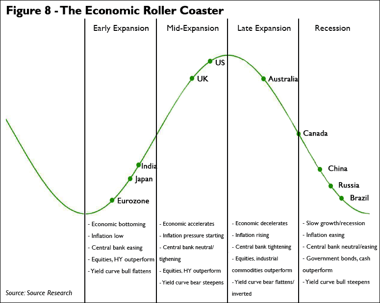
The following chart, “The Economic Roller Coaster,” was recently posted by @NickatFP and provides a helpful illustration of where major economies are believed to be located in their economic cycle.
It shows the Eurozone, Japan, and India in the beginning phase of an expansion, US and the UK near the peak, Australia and Canada decelerating, with China, Russia, and Brazil near a trough.
As Sober Look recently noted, this is “probably the most accurate representation” of current economic data and trends in growth rates.
Although this chart uses the metaphor of a roller coaster in terms of the ups and downs, peaks and troughs, of an economic cycle, it should be noted that these are slow moving trends that typically last for years. Secondly, unlike a roller coaster where each car is separated on the track and moving at the same speed (thankfully, to prevent collision), there is no predictable or constant velocity for each nation as they move from one phase to another.
If we could speed this up and show movement over time, the first thing we would notice is that every region moves at a slightly different pace with the duration of time spent in each phase variable as well. Also, regional shocks—whether political, financial, or economic—may derail one or more of the above and cause them to relocate at different points.
All in all, the economic roller coaster is probably more like Chutes and Ladders (or Snakes and Ladders to those outside the US).


